Portfolio
My University and personal work.
About
I am a 3D Development student currently studying in Winchester, I also do design work with a focus on environments and character concepting. I have experience with Maya, Quixel Mixer, Blender and Photoshop as well as limited experience with Zbrush.
Game Project Character Concepts
Year 1 Semester 1
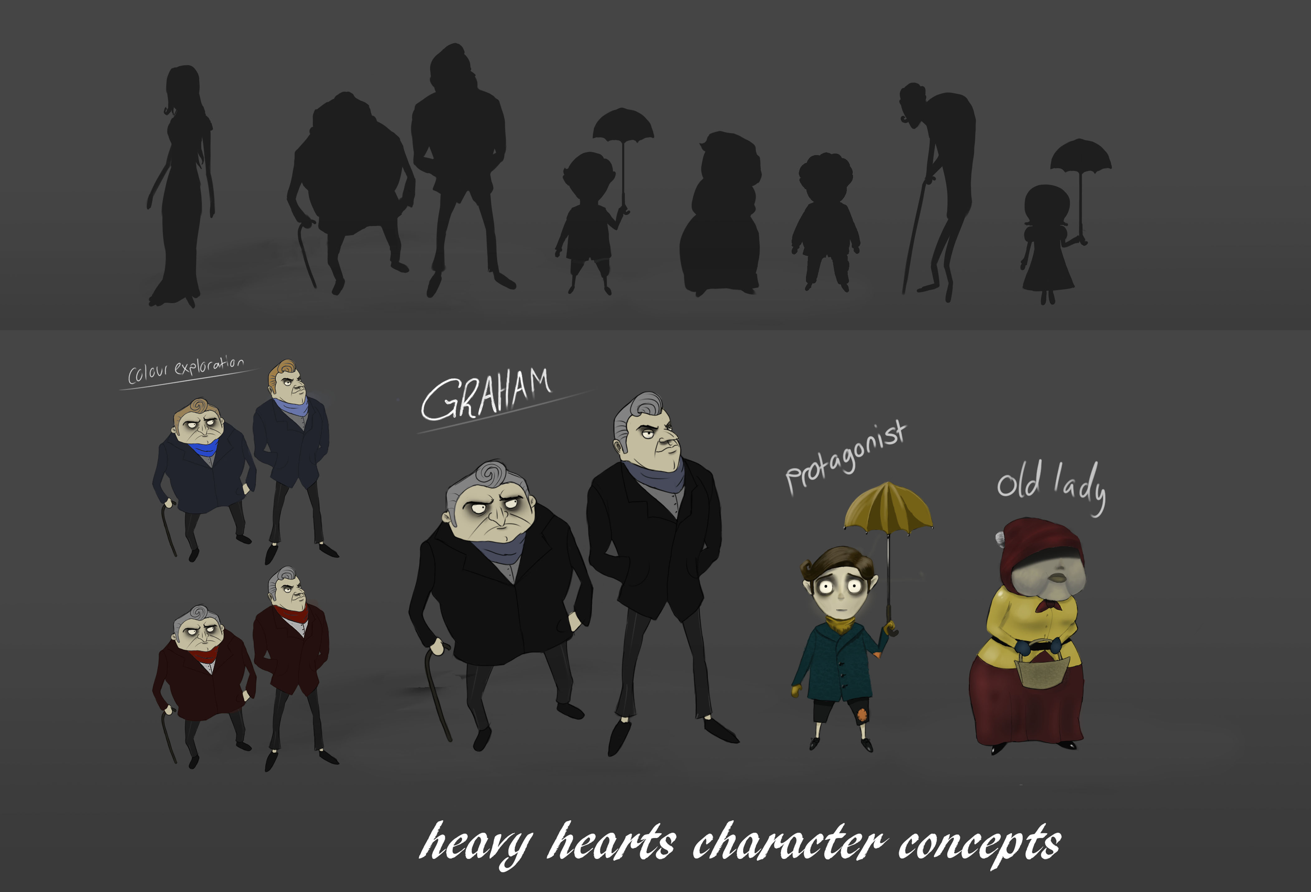
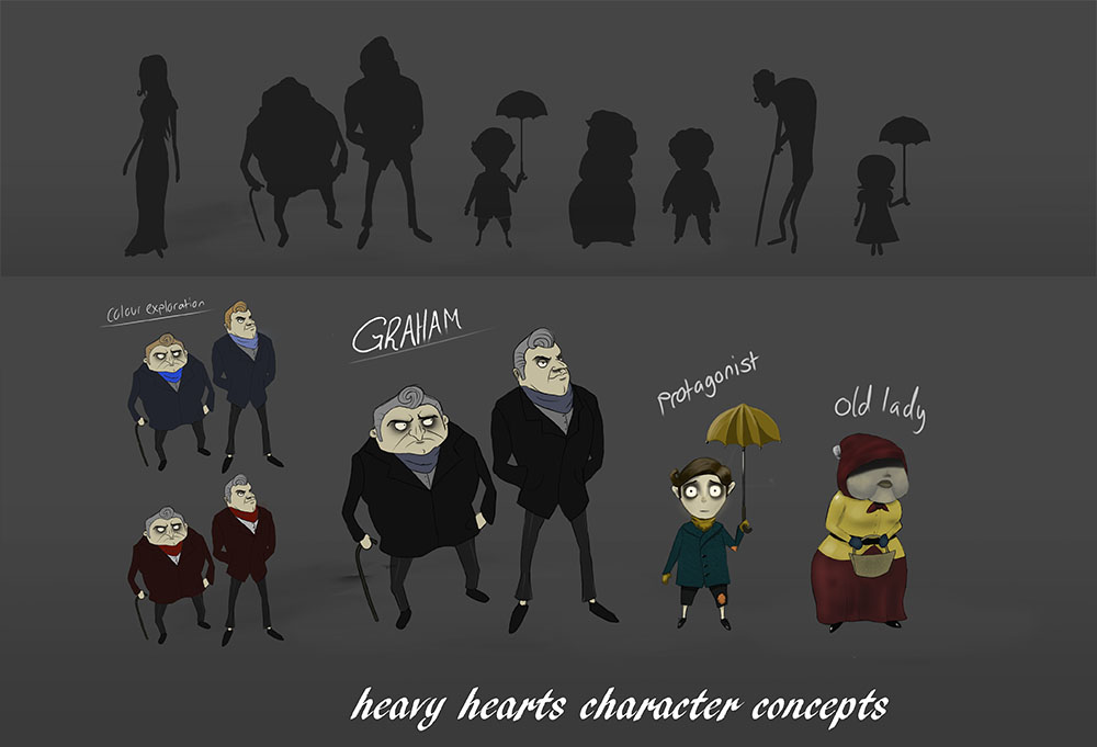
For the Game Project I was put in charge of coming up with character designs and deciding on the art style we would use for the game. To that end I decided that the style of Tim Burton's animations such as the Corpse Bride would fit best with the tone of the game as being a dark yet cartoonish/exaggerated world. I begun work by researching characters from different animated works to get a better understanding of how Burton constructed his characters such as how the heads of children tend to be disproportionate to their bodies or how most characters have spindly limbs. Keeping this in mind, I started designing the characters in Photoshop by doing silhouettes of a number of characters, using a basic round brush to draw on Layer 1. I then set that layer's opacity to 60% and created a new layer to do line drawing over the silhouettes. I selected four of the characters for this starting with the protagonist, who I drew with an umbrella and a scarf with possible puzzles in the game in mind as my team agreed there would be platforming elements present within the game. Once I had done doing the line art for each of the four characters, I started blocking out colours for each of them. I decided on bright yet washed out colours that would match the atmosphere. It was at this stage that I decided to combine two of the drawings into one character called "Graham" who would act as a guide in the game and having two sides to his character. In doing the character designs for this project, the main issue I had faced was that I was drawing in a style I was not used to, which challenged me to think in a different way during my design process.
- Date: December 2018
- Year 1: Semester 1
Weekly Exercises
Year 1 Semester 1.
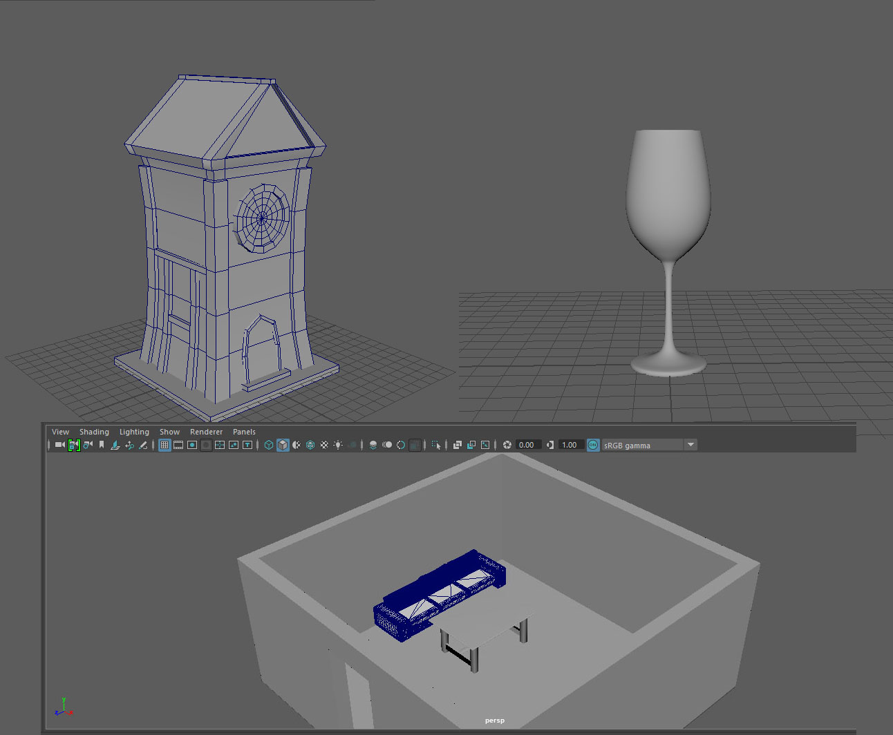
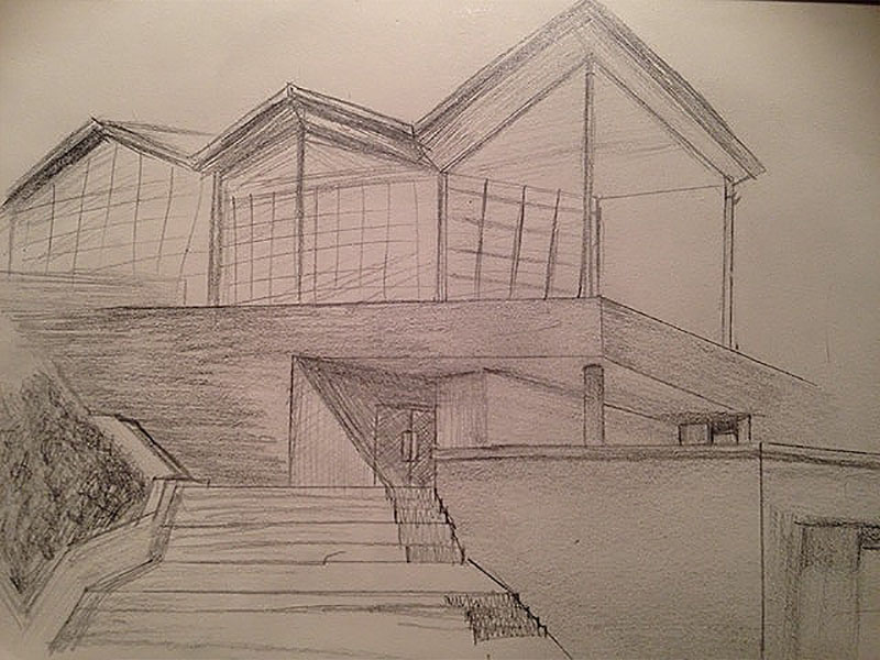
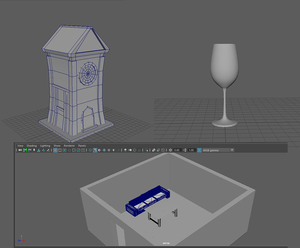
These are the exercises for learning Maya I did to familarise myself with the program. The above picture shows three of these exercises: the wine glass, haunted house and interior projects. The first of these was the wine glass in week 2, which was created in Autodesk Maya by bringing a reference image into the programme and placing it along the Z Axis. I then used the EP Curve Tool under the Curves/Surfaces tab on the Shelf bar to trace along the edges of the reference image in the front view. For the haunted house exercise, we were given one hour to create a model which fit the brief. I started by creating a polygon cube and using the 'R' scale to pull the top face to the desired height. I then created a number of edge loops by going to Mesh Tools > Insert Edge Loop and then used the edge tool to pull the edge loops inwards using the scale hotkey. For the roof I created a Pyramid Polygon and used the 'W' hotkey to move it into position. I then moved the selected faced until it was the correct shape and added edge loops. I then used the Ctrl+E Extrude tool to pull the faces into the finished shape. I then connected the roof to the main building by using the Bridge tool under the Edit Mesh tab to finish the main shape. The door frame was created by creating a two cubes and extruding and rotating them. I then added the window by subdividing a Cylinder and extruding the outmost faces, before rotating it to fit the wall. The final exercise I did was to create a room interior in maya using models from Turbosquid. For this, I simply created a plane in Maya and inserted Edge loops to create the walls. I then used a Boolean in the Edit Mesh tab to cut a hole for the door. The sofa and table were downloaded from Turbosquid and imported as FBX files. I also had the task of doing a quick 15 minute sketch of somewhere on Campus, so I decided to take a picture of an area in the middle of campus looking up at the main building and then timed myself. This sketch was done using a mechanical 0.5mm and a mechanical 0.7mm pencil.
- Date: September-October 2018
- Year 1: Semester 1
Game Project Model
Year 1 Semester 1.
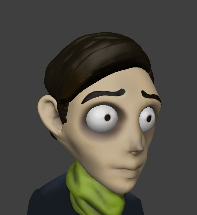
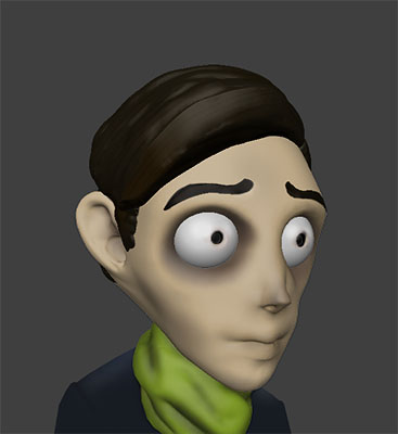
As 3D character designer for my group, I was in charge of creating the characters that would appear in the game. Due to time constraints, I was only able to create a model for one of the characters within the game that being the protagonist. I started within Autodesk Maya by importing the work I did for character concepting for use as reference. After getting part way through the project, I later switched to Blender as I had more experience in that programme. For the modeling in Blender I started with a basic sphere and started by manipulating edges to get the desired shape. I then used masks to create the sunken eyes of the character and to bring out the ears. After being happy with the basic shape of the model, I brought it into Sculptris to add details such as the irises and eyebrows of the character as well as adding some detail to the hair. The textures were done by Sculptris' Paint mode, which allows for direct polypainting. After doing my work in Sculptris, I then brought the model back into Blender to clean up some of the edges and add polish to the model. I faced a number of challenges in this project particularly as I had no prior experience of character modeling, particularly in Maya which is why I switched to Blender for this project.
- Date: Dec 2018
- Year 1: Semester 1
Dark Forest
Personal Work.
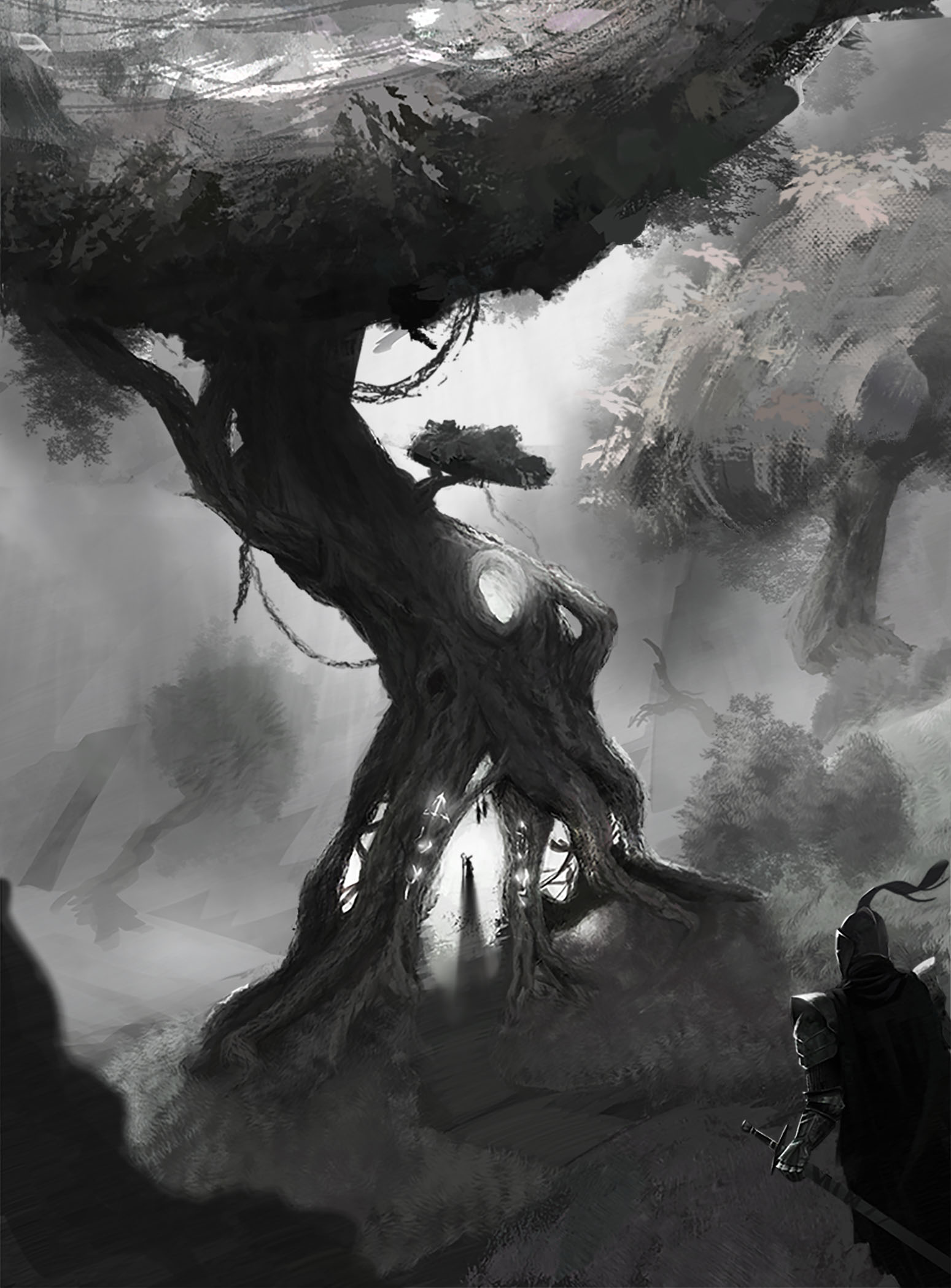
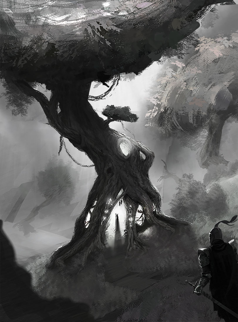
I decided to do a remake of my swamp drawing that maintained the tree element of the original drawing. I finished the drawing in about 3 hours using my own custom brushes in Photoshop C 2016. I decided not to use colour as I did this with more of a focus on value and contrast.
- Date: October 2018
Swampwoods
Personal Work.
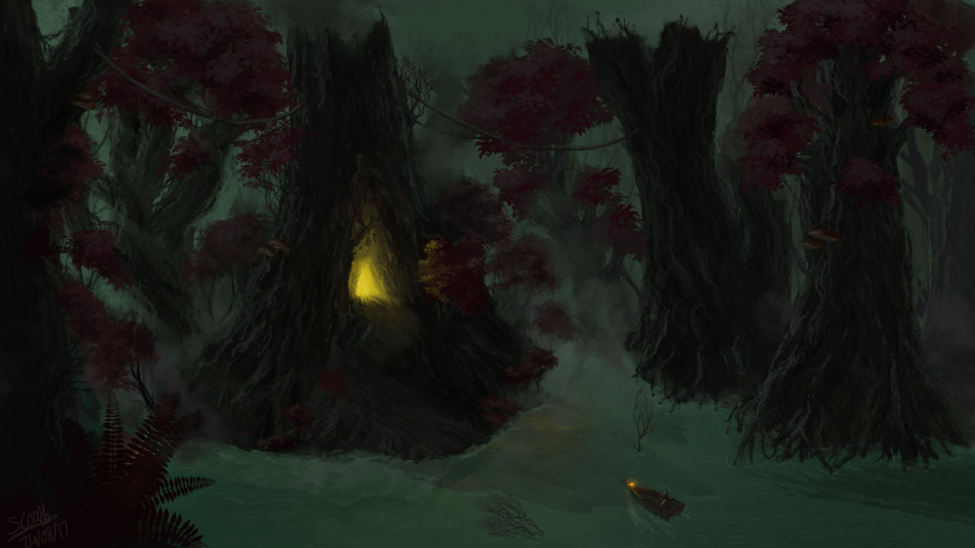
An old drawing I did back in 2016. I created it over the course of a week using custom brushes in Photoshop CC 2016.
- Date: July 2016
'Around the World'
Year 1 Semester 1.
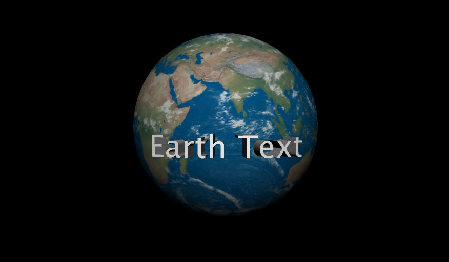
The task for this weekly project was to make text wrap around a sphere in maya and then use the lighting available to show a render of the scene. During the process of making this I faced only one issue in the form of my reference being outdated which meant I had to try to find alternative methods of carrying out the task. I started by Creating a simple Poly sphere in Maya, which I did by going to Create > Polygon Primatives > Sphere. I then used the attributes panel to make sure that the sphere was placed in the centre of my scene. I next had to place the text in the scene so I could then wrap it around the sphere. I did this by going to Create > Type, which creates 3D text. As the text I had created was too large, I had to scale it using the 'R' hotkey to allow for it to fit onto the surface of the planet. After having done this, I went to my attributes panel again in the Type1 tab in order to change the text to display the message I wanted. After this, I had to wrap the text around the planet which I did by playing with Bend Deformer tool under Deform > Nonlinear > Bend which places a line that shows how the object will be curved. As the curve was currently facing downwards, I rotated the line using the 'E' hotkey and set the curvature value of the text to 30. After this was complete I was finished with the model, and I decided to add an Earth texture to the sphere from http://www.shadedrelief.com/natural3/pages/textures.html to finish the look. I then added a simple directional light to the scene by going to Create> Light> Directional and rendered the scene.
- Date: November 2018
- Year 1: Semester 1
'Mobile Project'
Year 1 Semester 2.
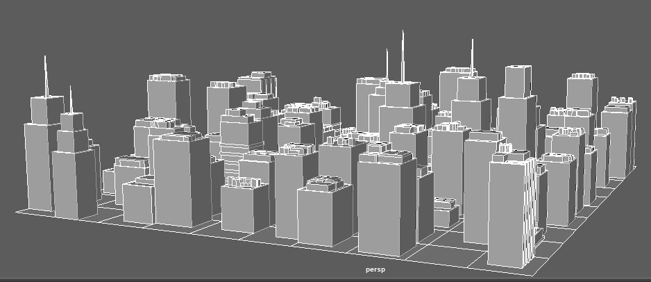
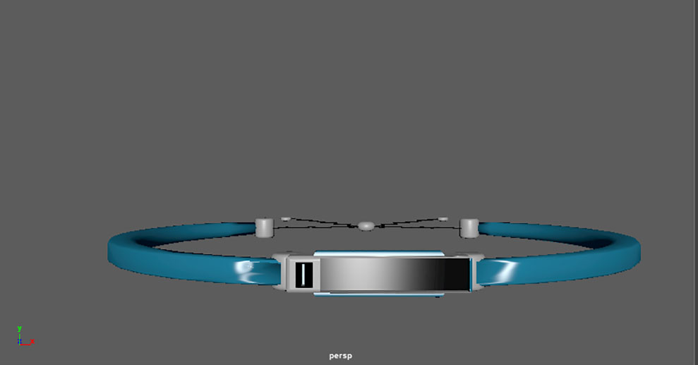
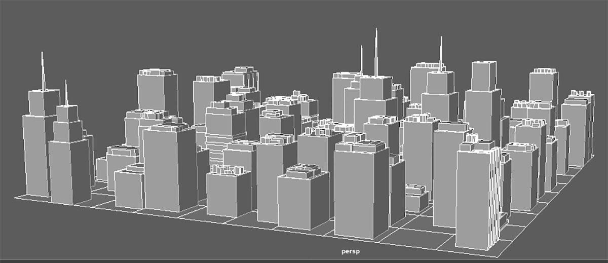
For this project my group were tasked with creating a device that could be used for social events such as festivals or general day to day travel. To this end, we settled on the idea of a smart bracelet device that could be used to keep track of your children when on a day out as well as a small drone that utilised facial recognition to locate individuals within a crowd. As the only 3D specialist in my group, my role was to create a short video that showcased our device and its purpose, which I was not able to do due to the short timeframe for the project. The work I was able to create during this time however was creating a city scene within Maya by using a plugin I found online to place a number of cube meshes on a plane I had subdivided by 10 in order to give the effect of city layout. I then went in and added details to the buildings onto the roofs and walls such as antennae. With this being done, I used the EP Curve tool in Maya to hand draw a path through the city that I would attach a camera to as it passed through the streets from the POV of the Drone and find the character with the Bracelet. In addition to work I did for the cityscape, I also took the models that the CAD members of my group had made in Revit and added materials in Maya so they could be used in the scene. This was particularly challenging as the model for the drone in particular was one single object that I could not individually do the faces for and thus looked out of place compared to the work I did on the bracelet itself. For the bracelet I looked at the sketches my team members provided and made changed the material of the actual band from a Lambert to a Blinn material and then made the front piece black and into a Phong material so it would give the appearance of a screen. It was around this point that we decided that the main part of the device was not that it was a bracelet as we felt that would be too constricting and instead made the bracelet more of a case for a module that could be slotted into other accessories such as hairclips etc. I had planned to model these but again due to the short 5 week timeframe on the project I was not able to do so. Overall, I felt that I did not have the necessary skills to fulfill the brief in the timeframe and that if I had to do this project again I would be more assertive when communicating with my team so I know what I had to do by what deadline.
- Date: January-February 2019
- Year 1: Semester 2
Interactive Project
Year 1 Semester 2 Transmedia 2019 Winner.
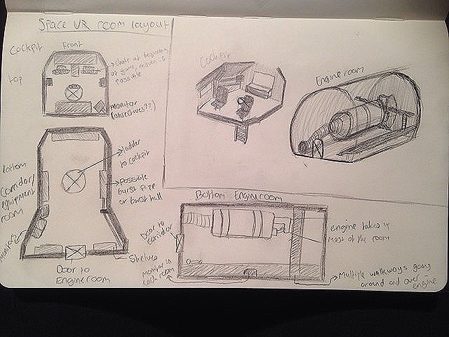

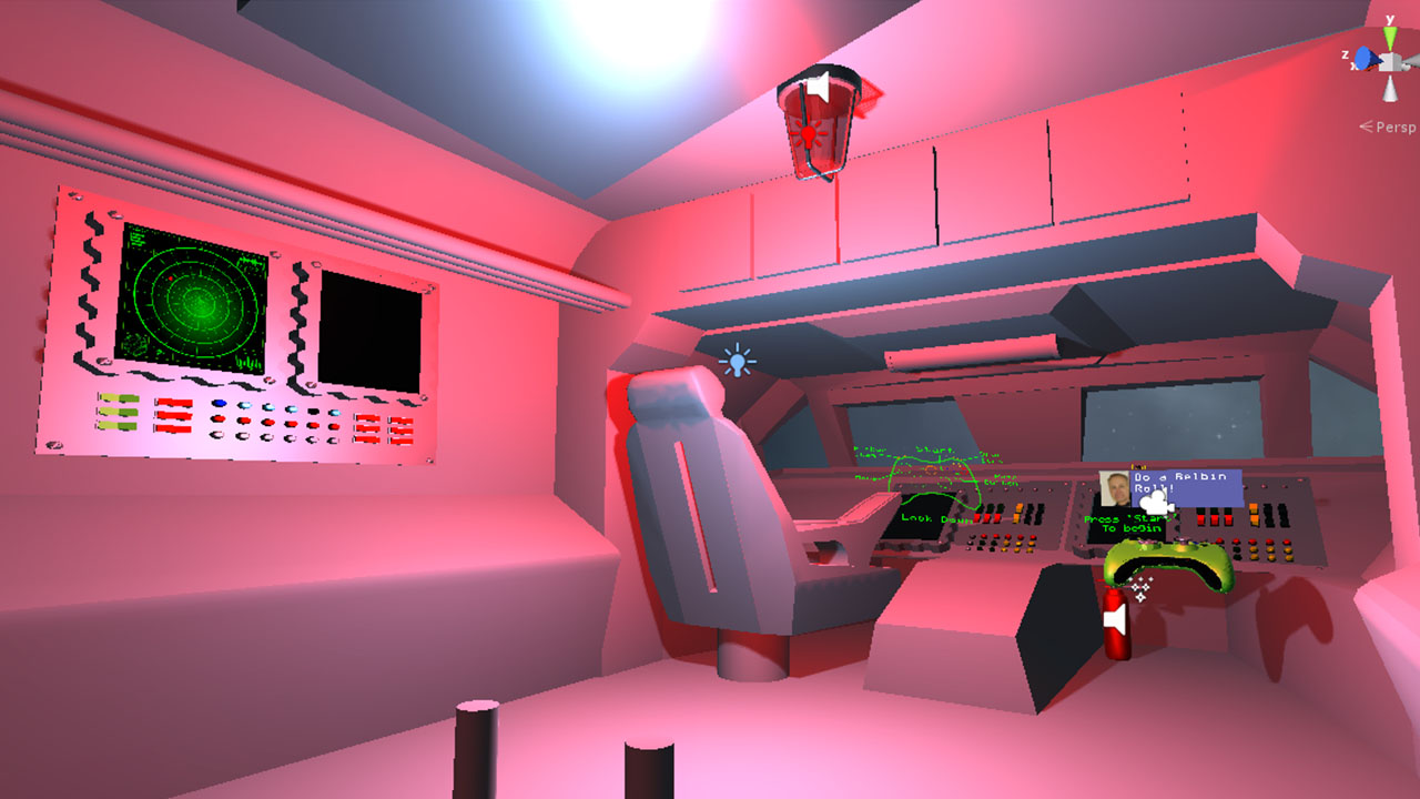
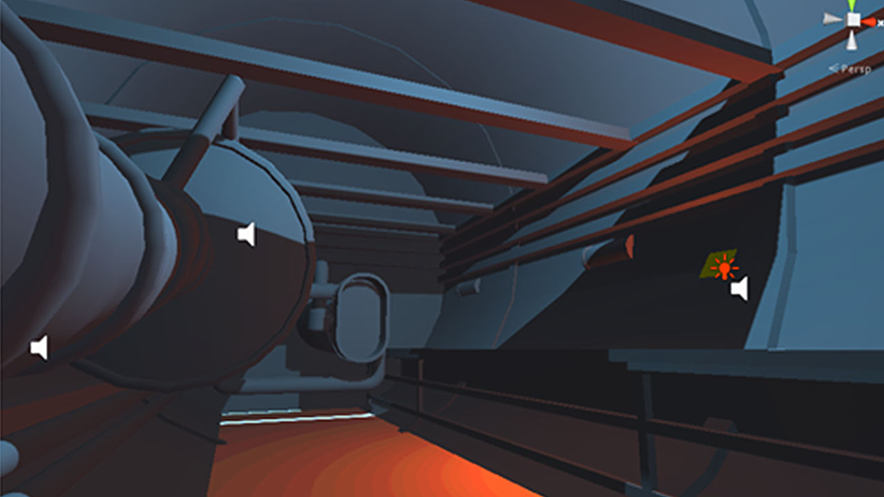
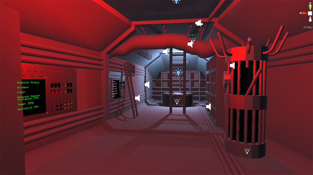
For the interactive project I took on the role of both environment modeller and, due to the absence of my teams designers throughout the project, concept artist for my team. Our goal for this project was to create an interactive project that was aimed towards children in education that would be showcased at the Transmedia 2019 end of year show. At the beginning of this project, my team had originally planned to create a 'shrink ray' using an oculus rift that would allow players to walk around a 3D modeled version of a physical model at our booth. Eventually we decided on instead creating a space themed escape room scenario that would teach the players about the problems that can occur on a shuttle. As I was in charge of concept art and art direction, I started sketching floorplans on paper and then drawing what I thought the rooms would look like on this shuttle whilst also basing my drawings on pictures of real shuttles. I then started modeling in Maya by creating the center of the playable area which was the corridor/equipment room that bridged both the cockpit and the engine room. To do this, I created a Polygon Cube and flattened it, before extruding the side that would be facing the engine room and then using the Edge tool and scaling it to create the flared end to the corridor. I then inserted edge loops using the Top view to make sure they were even on all sides and then extruded these to create the walls. I then inserted another edge loop towards the top of the wall and used the edge tool and scale to pull the tops of the walls inwards to create the slope. After figuring out the rest of the ceiling and having the room blocked out, I then started adding detail by using a boolean to cut a circular hole in the ceiling that would lead to the cockpit. I then added the shelves and pipes to the scene and moved on to the cockpit after sending the corridor to our developer Lewis so he could place the scene in Unity. For the cockpit, I saved time by using a face selection of the front portion of the corridor and hiding the rest of the geometry before copying it and building the rest of the room. As this room had windows in the front that from reference were slopped, I used the multi-cut tool to draw out the windows instead of using booleans again as they were troublesome and caused issues with the project. The rest of the cockpit was straight forward and mainly involved copying the pipes over from the corridor and using the multi-cut tool to create the desks seen around the room as the monitors in the corner of the room. Next I had to model the engine room, which I only had a few days to do due to having significant problems with the mesh not loading correctly when opening the scene. For this room, I created a cylinder polygon mesh and used the attributes menu to put it to 90 on the Z-axis and using an edge loop and bridge loop to fill in the ends. We then had one of our CAD team members send over a stock model of a shuttle engine which I imported into the scene and modified to make it work within the model. In my concept I had originally planned to have a number of catwalk type platforms in the engine room that would make for a more interesting design, however the idea was scrapped due to both it deviating too far from actual shuttle design and also due to the issue of that putting more of a workload onto our developer to add in extra scripts. After having completed the modeling for each of these rooms, the original plan was to add textures and then place them into the scene which I had started to do before the end of year show, however as a new build had been made using the untextured version that is the one that we had to use for the actual end of year show. Regardless of this, I am satisfied with how the project turned out as after finishing it I now feel I have a firm grasp of modelling in Maya and am proud for it to have won the transmedia 2019 competition.
- Date: March-April 2019
- Year 1: Semester 2
Client Project
Year 2 semester 1.
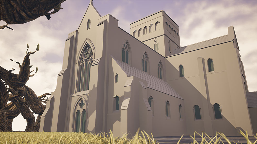
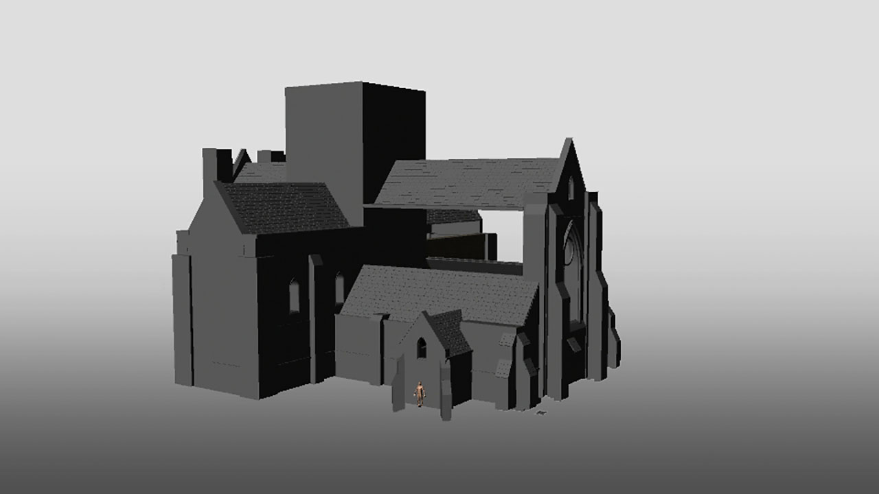
For the client project in semester 2 it was my job to create the environment for a correctly referenced, realistic model of the site of St Cross Hospital as well as to create the chapel at the center of the grounds. As my team was comprised of myself and two CAD students, I was also given the task of bringing all of our work together in Unreal engine to showcase it, though we did not get that far. As I had taken on the job of doing the main chapel, I started to look at reference pictures that were provided in the brief as well as look at floorplans that had been provided in order to get an idea as to how I would create the structure.
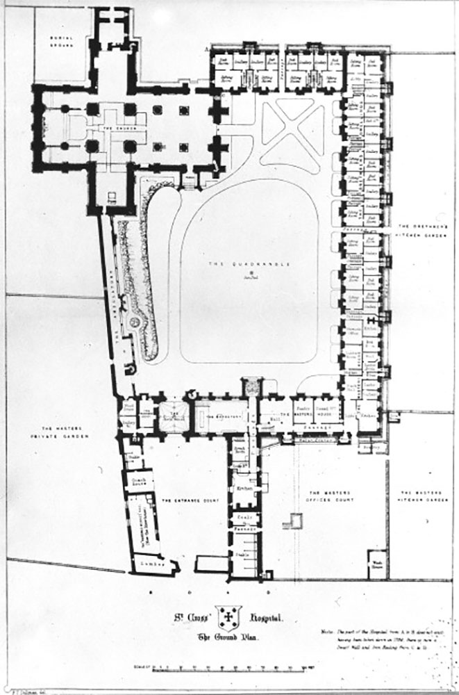
After collecting the references, I then brought this floorplan into Autodesk Maya as an image plan and proceeded to place polygon cubes for the outside walls, leaving spaces for windows and columns. I had decided early on that I wanted to try to create the chapel out of modular pieces that would fit together when assembling it in Unreal as at the time I believed it to be the most efficient way of modelling the building. During week 3, we were able to visit the site to collect more reference and look at the grounds.
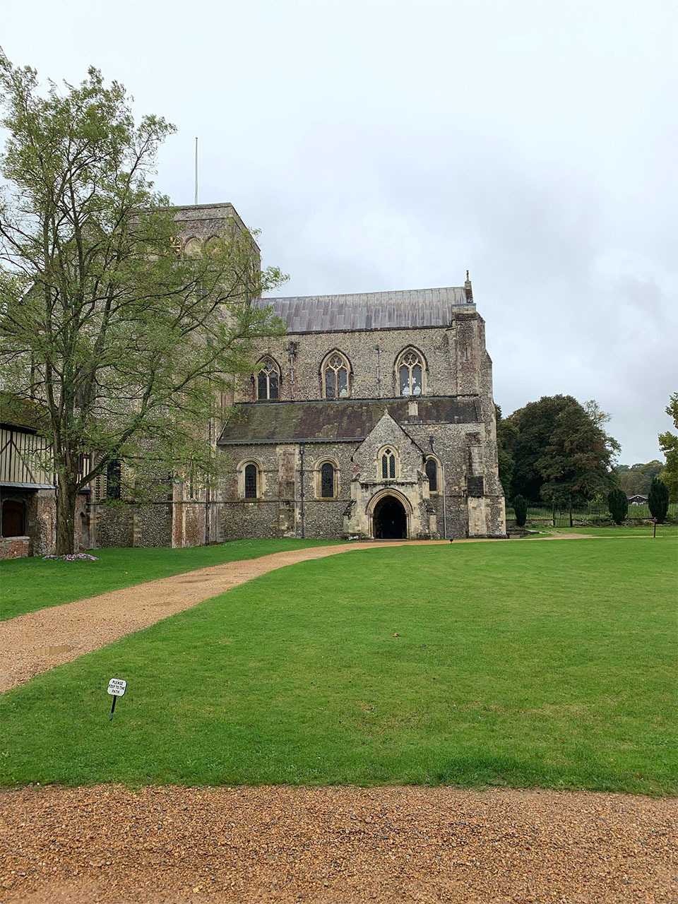
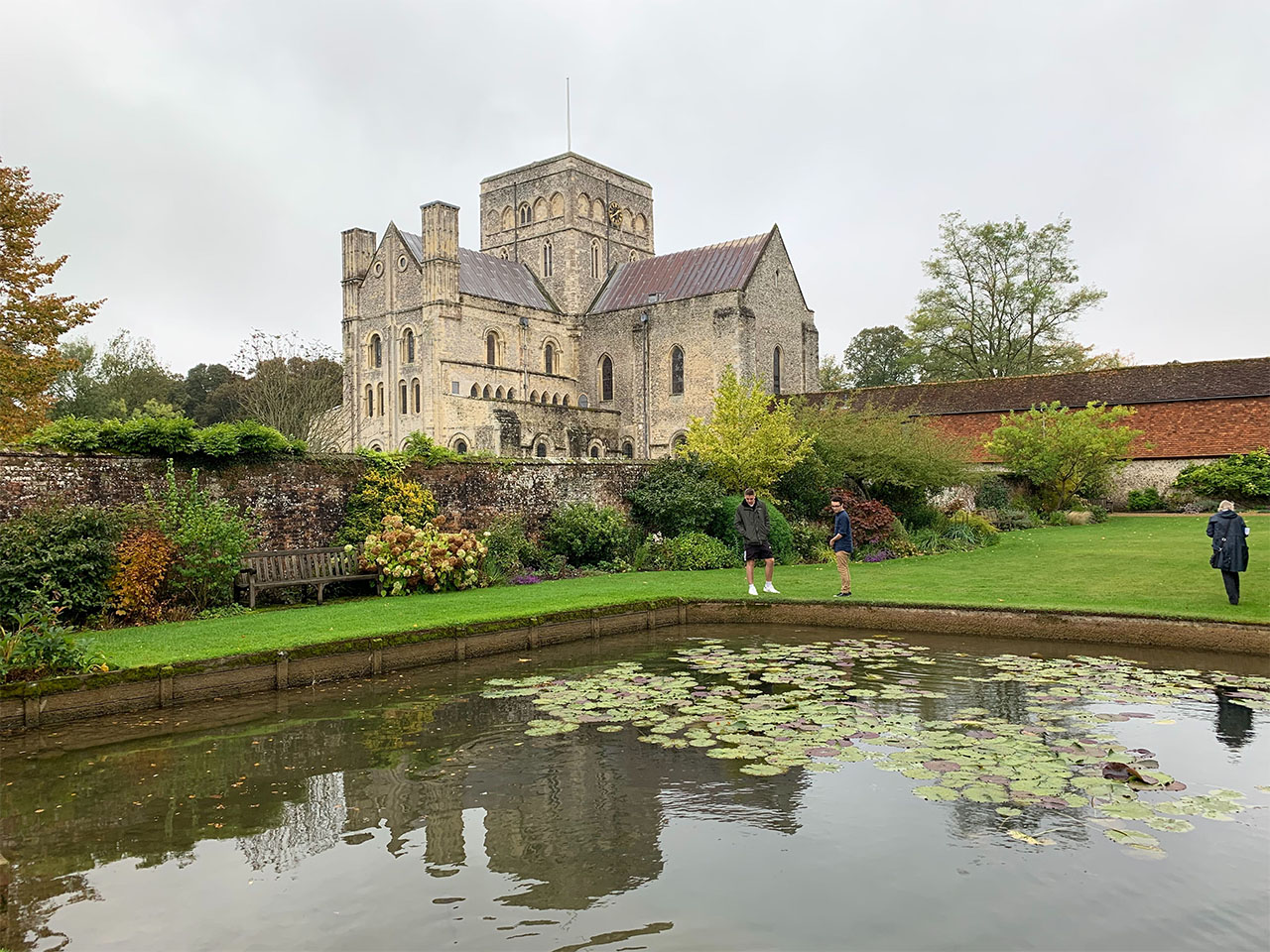
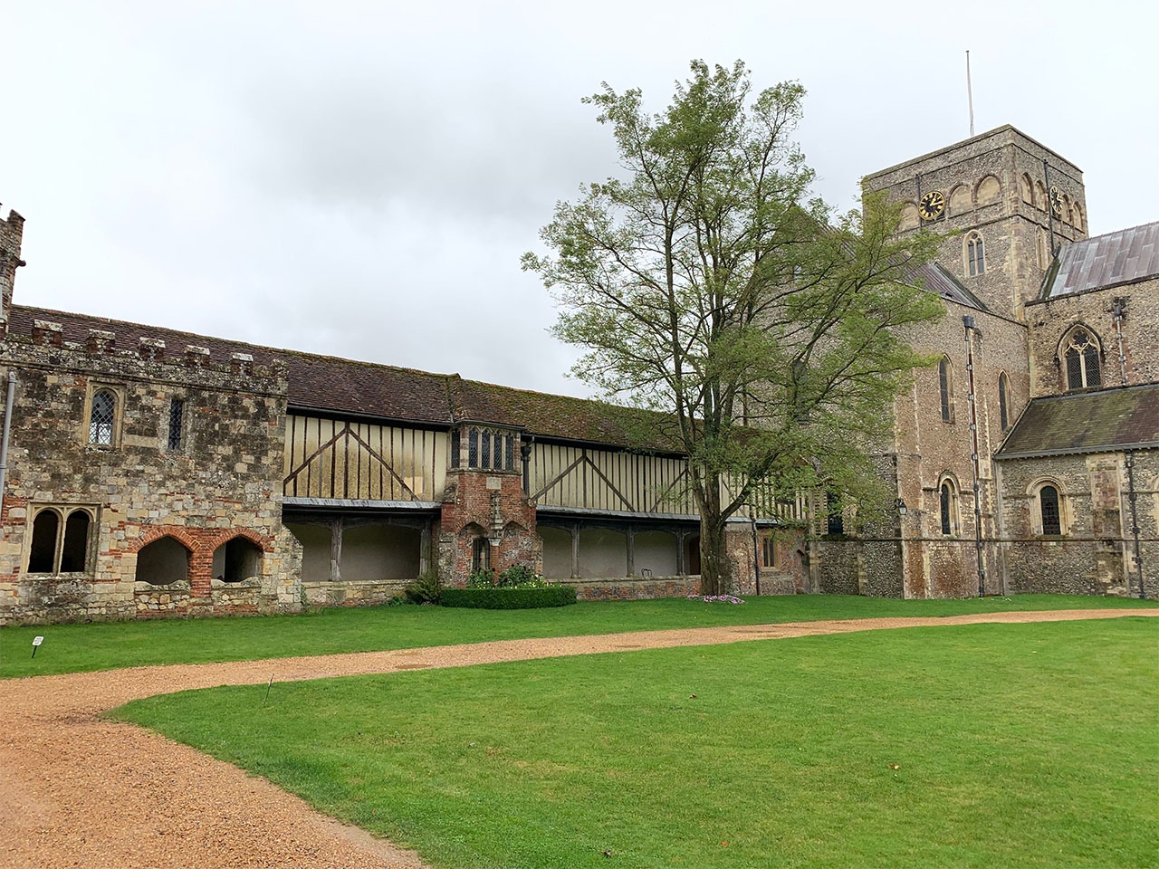
After visiting St Cross, I realised that there were a number of inconsistencies between my model and the real building such as the walls on the back not being symmetrical to the ones on the front side. It was at this stage that I realised that while working with modular pieces would be effiencent, I did not have the time to do so as the structure itself had different walls on each side which were different lengths. Around this time I also created the roofs, which I did with the help of my lecturer, in a versatile way that allowed me to make them easy to change for each of the different sections.
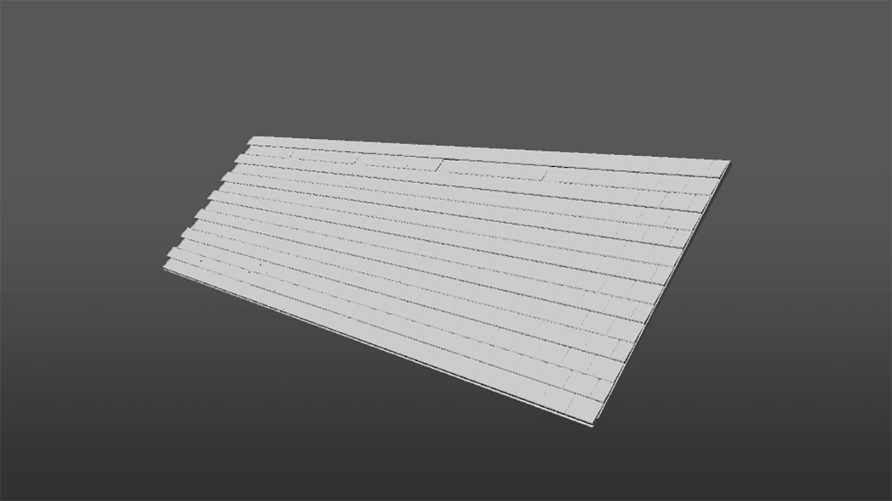
After adding in the roof, I was quickly able to get the front of the building into place, with the front top windows needing to be created separately due to how complex they were.
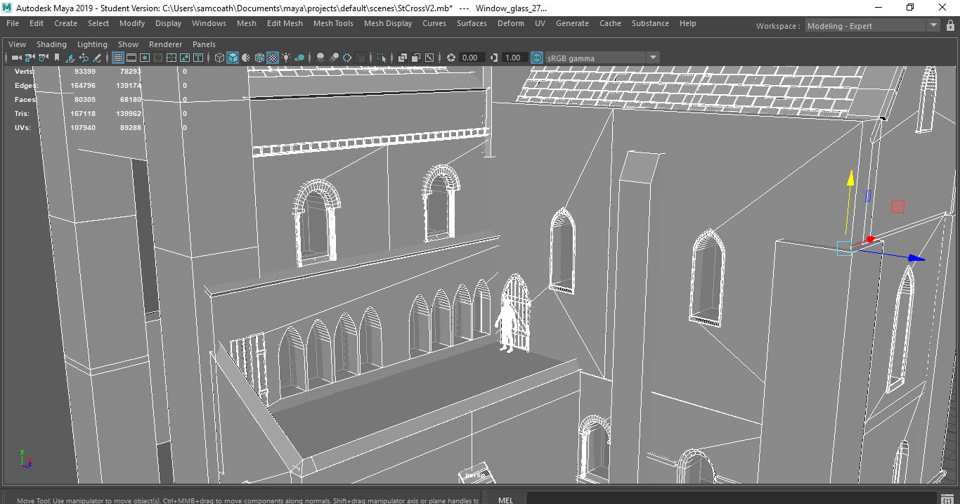
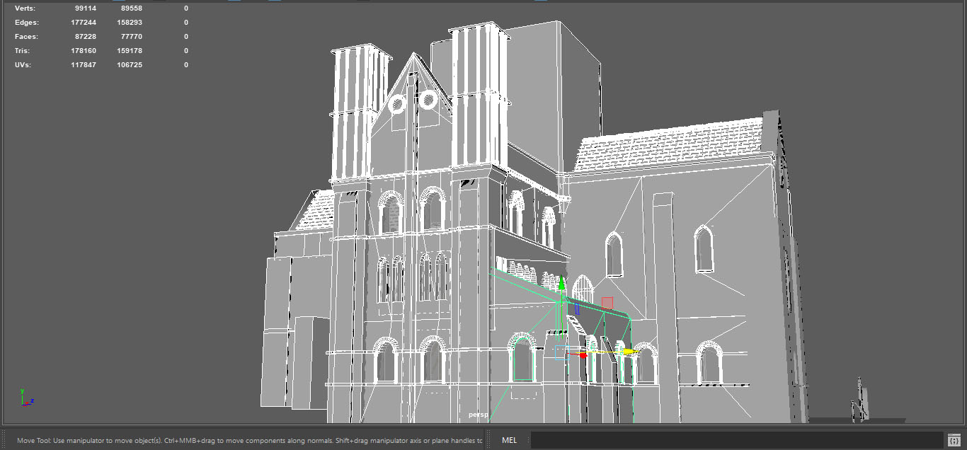
After having modelled most of the front, I then moved over to the other sides of the building. Having little reference for these parts, I had to look into the structure of similar buildings as well as looking at artists interpretations of the chapel to make it feel as accurate as possible. The back walls in particular were a challenge as they had lots of windows in a small area which caused me to run into trouble using Booleans in Maya. Additonally, I also found that the pillars at the back changed between each of my references so I was not sure which was the most accurate to the original building. The back area was not difficult to model except for the booleans, as I already had the buttresses and window details from doing the other sides.
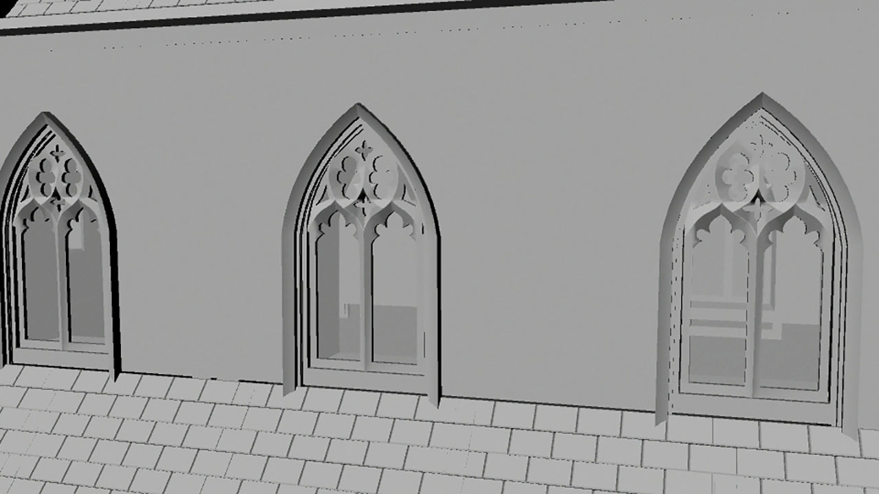
At this point I had almost finished the big details of the chapel however there were still the intricate windows on the front side and the large window on the side. Initially, I had tried to poly model them by using an image plane and extruding polygon cubes over the detailing, however I found that it did not resemble the window at all. It was then suggested that I try to use Adobe illustrator to create a line path that I could then bring into Maya and extrude in order to create the detail, however as I did not have a copy of illustrator I had to resort to placing a plan over an image of the windows and then using the multicut tool to trace it. I then was able to use the move and extrude tools to make the window detail look 3D.
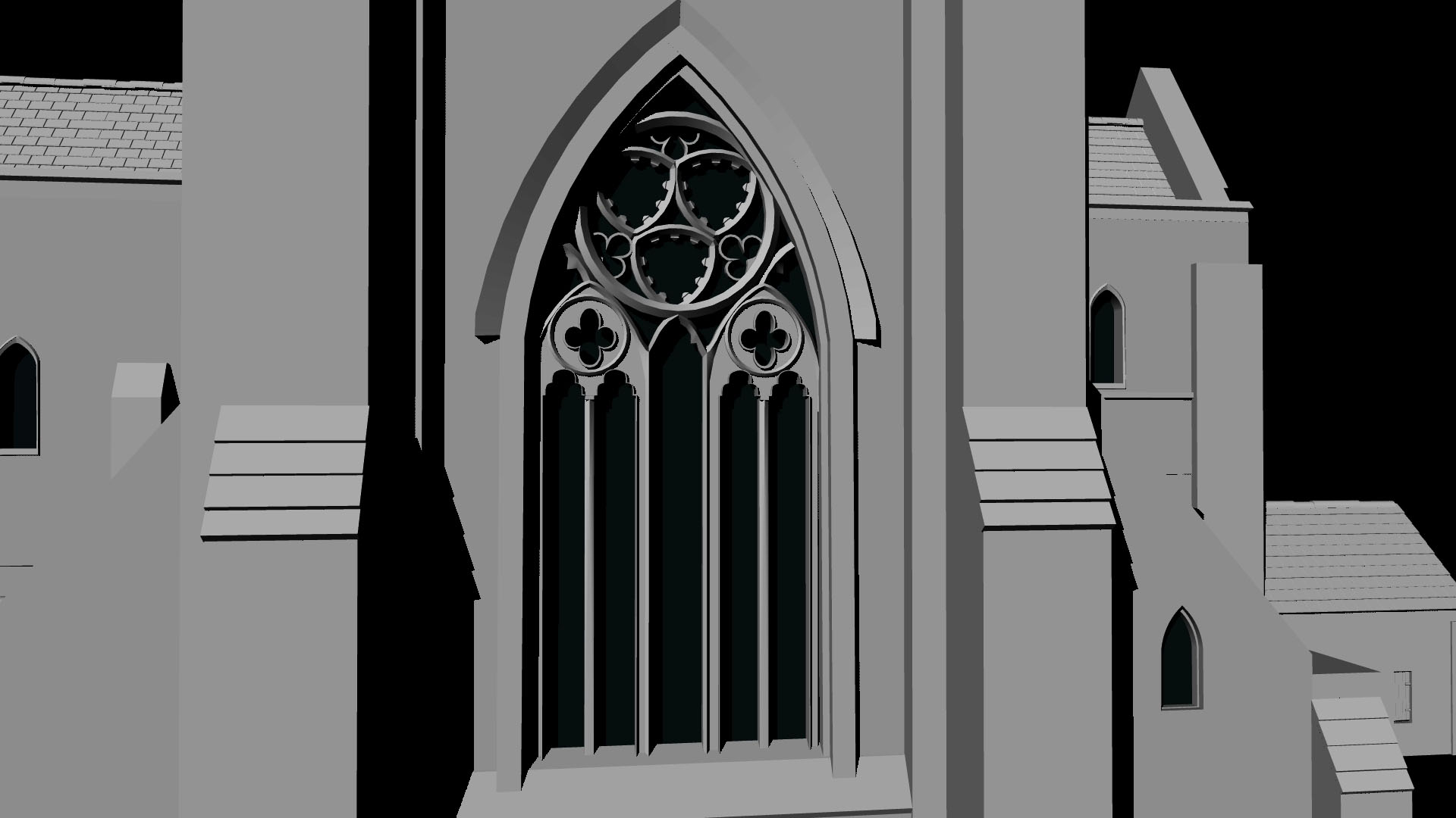
Once I had the windows in place, I began to work on the main tower on top of the chapel. I created it using a solid polygon cube which I removed the center from using a boolean. I then added windows and created a glass material to go into them as well as creating the roof 'lip'. After this I bevelled the edges to match the actual tower and pulled in the detail using the extrude tool in order the achieve the effect I wanted.
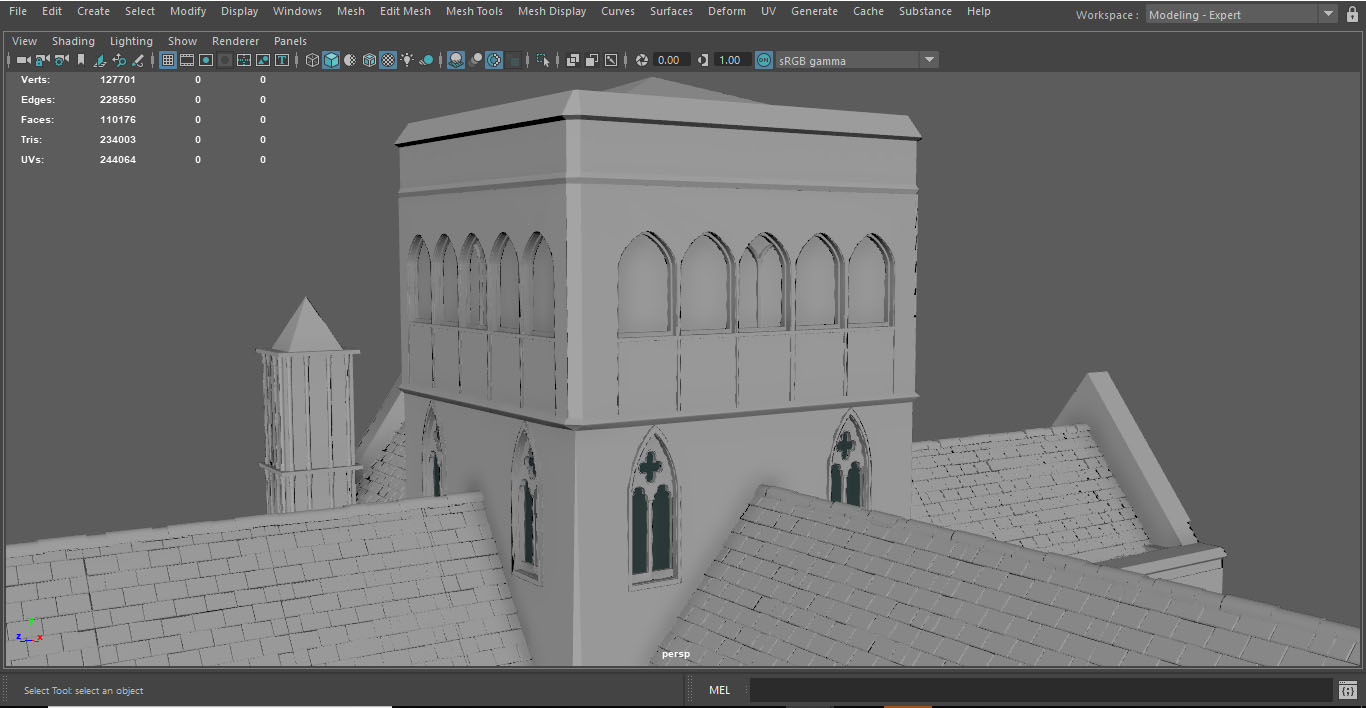
After making a few more changes such as fixing small gaps between walls and adding materials to different sections such as the window glass, I had finished the model for the chapel.
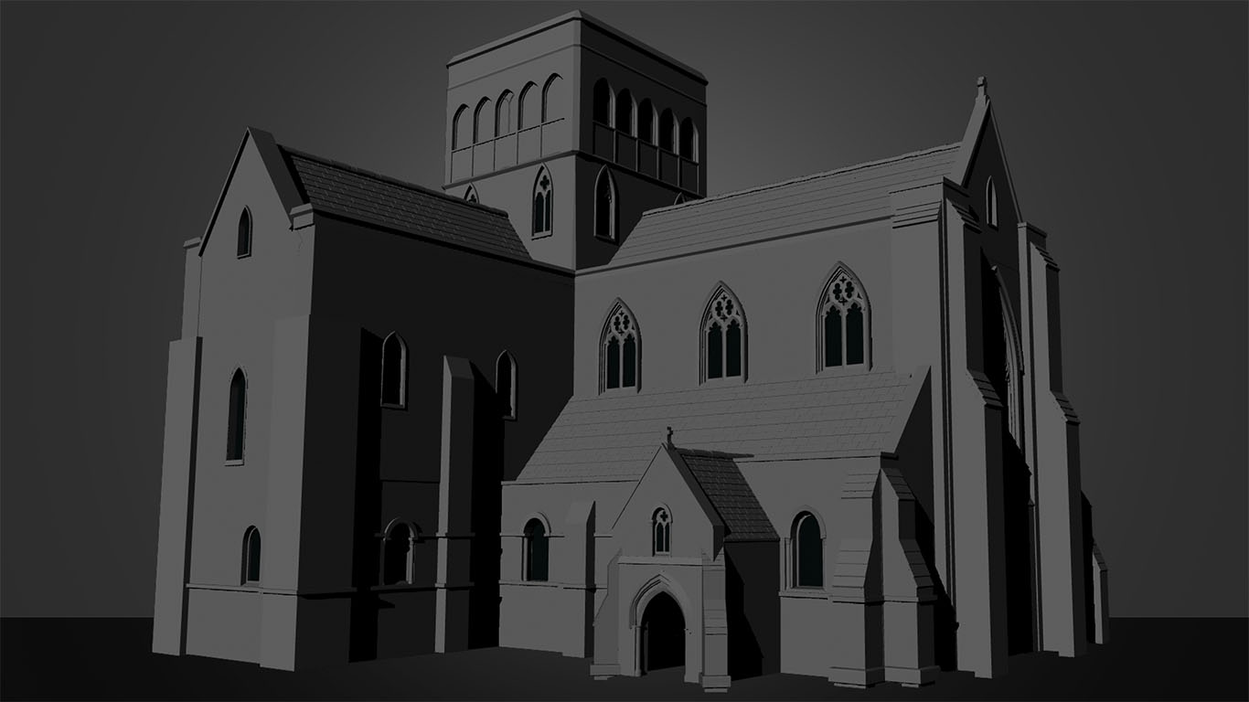
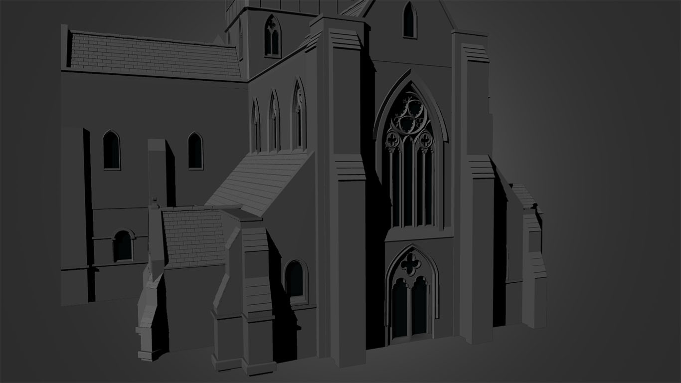
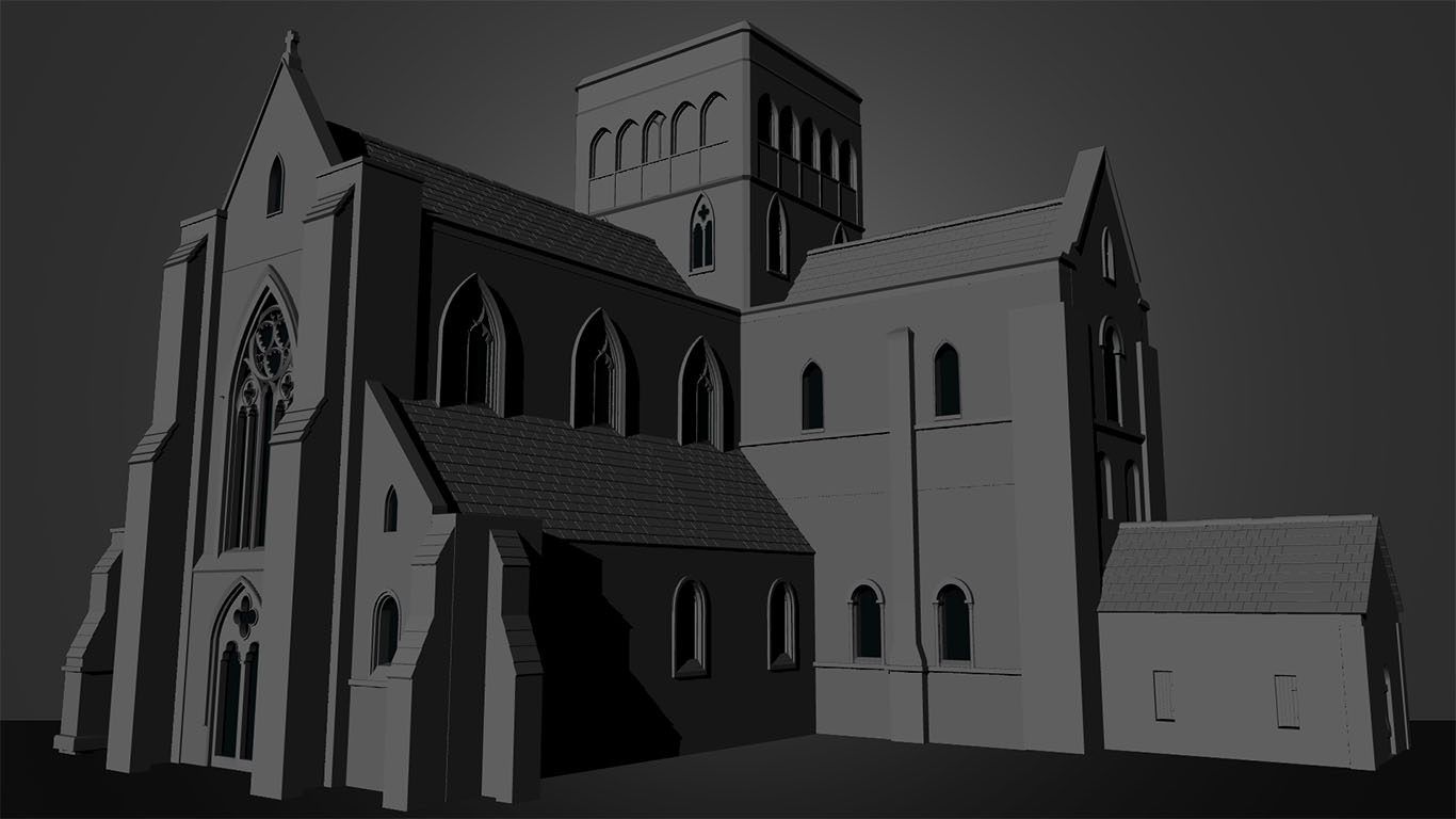
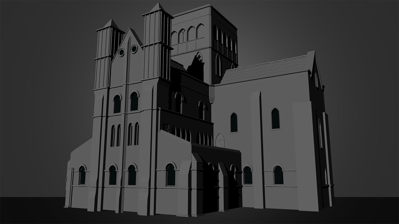
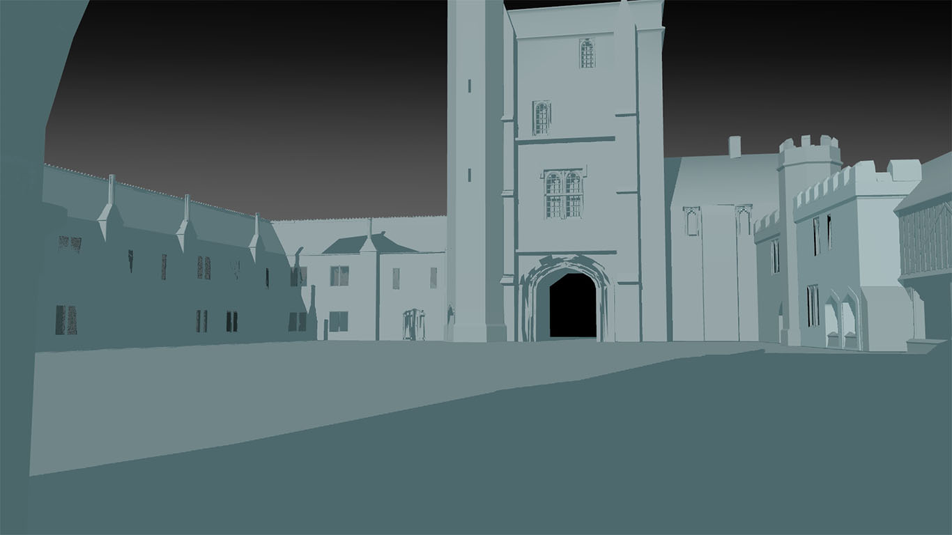
At this point I was able to bring the model into Unreal to begin to create the courtyard. I did so by using a lighting preset by Polygon Academy and then changing it to match the lighting in one of my reference photos. I then used assets from the Unreal marketplace in order to populate the scene with grass and trees so I could get a quick idea of how it would look.
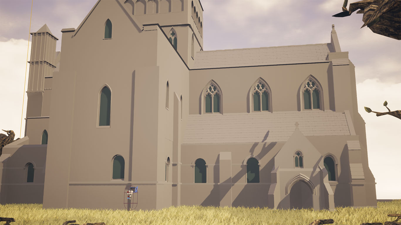
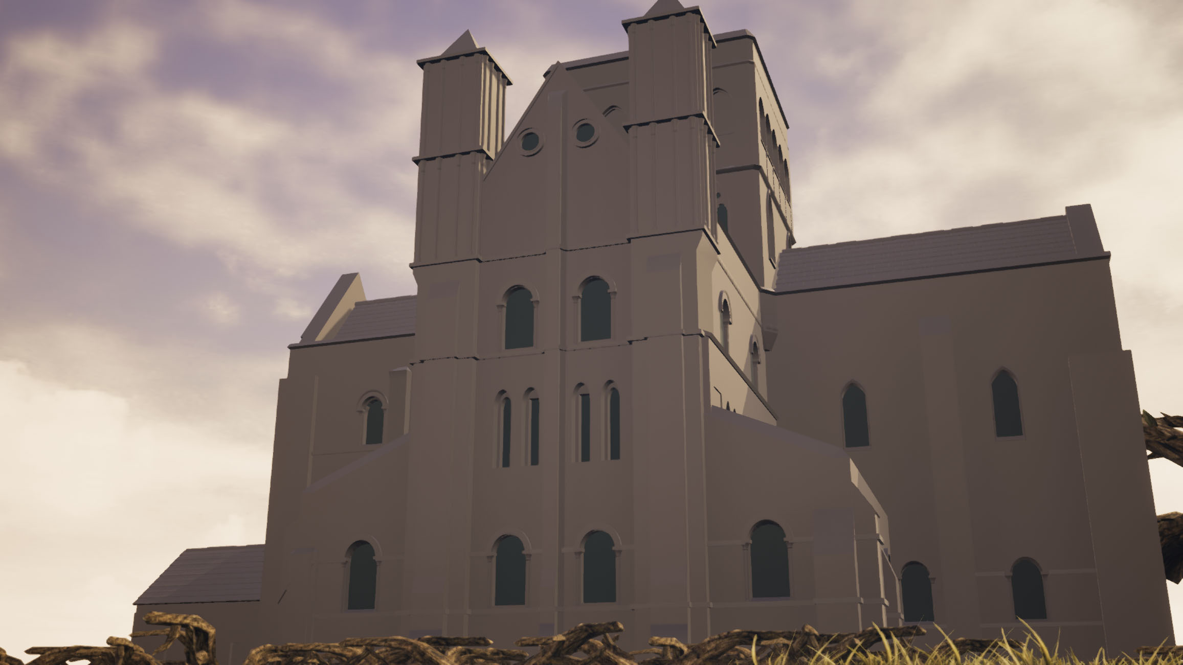
unfortunately, I was not able to get further than this due to running out of time to completely UV the building which was my next step. This meant that I could not apply textures to the building. Additionally, as my teammates were unable to complete the surrounding Almshouses I was not able to assemble the full courtyard in Unreal by the end of the submission.
- Date: September 2019-January 2020
- Year 2 Semester 1
RSA Case Study
Year 2 semester 1.
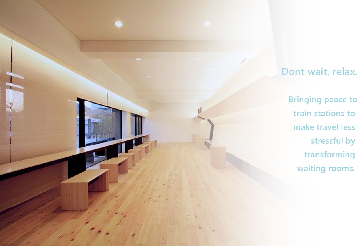
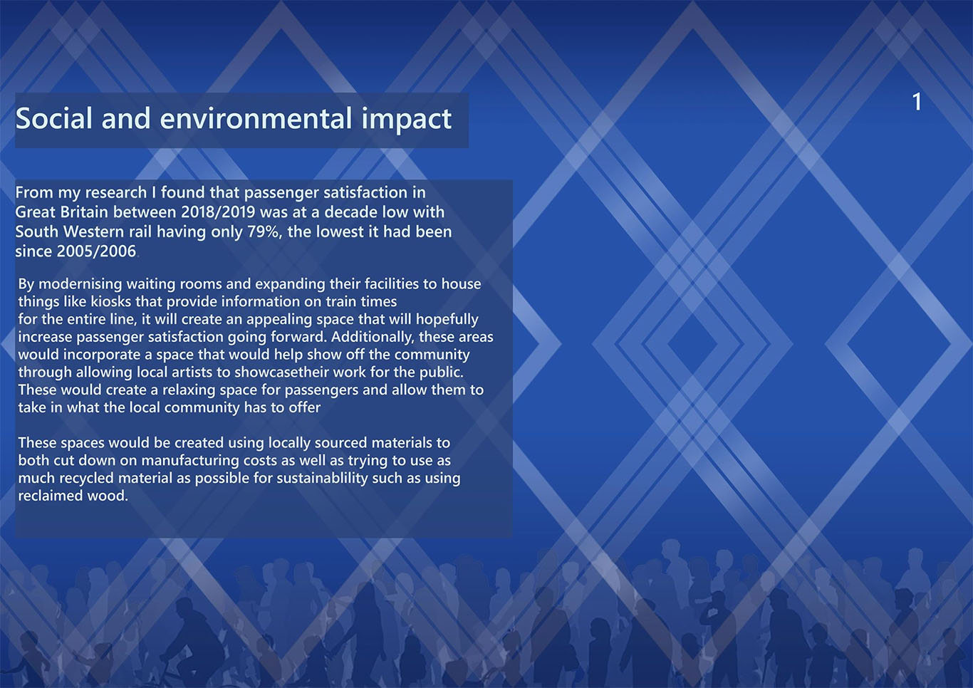
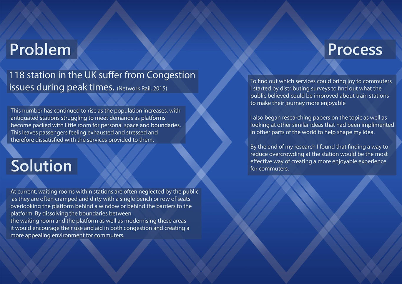
The RSA Student Design briefs that we recieved are a selection of projects that focus on proposing solutions to various problems in society. The project I chose centered around brief six, 'A Platform for Joy' which revolved around the idea of bringing joy to train station commuters by finding a way to enrich their experience. This project had potential to be very flexible for my specific pathway and was required us to write a case study on how my given solution would help address the issue put forward in the brief. I also had to produce a number of art boards that helped explain my idea and that had supporting material.
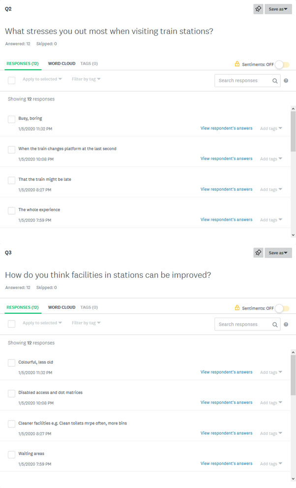
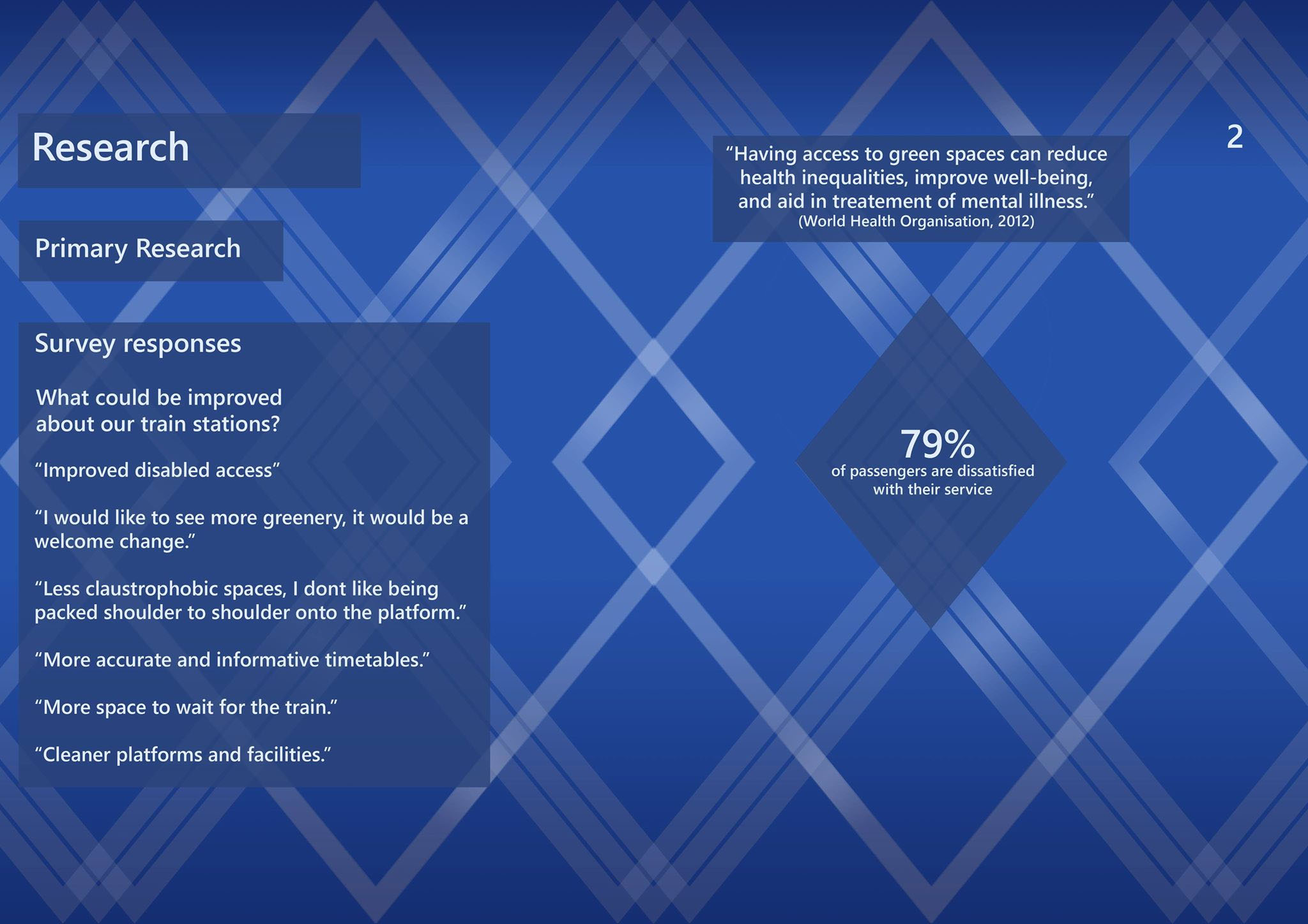
As someone that makes long train journeys often, I wanted to find a solution that would take the stress out of the activity and that could improve on existing solutions. Through my own experience, I found that overcrowding was a big contributor to the stress of going to the train station and wanted to find a way to reduce it. I then started to gather primary research on the subject by putting out a survey on what commuters found stressful about train stations. From the responses I got I found that I had asked too broad a question and mostly got answers relating to trains running late. I then refined my survey by asking if people believed that overcrowding at stations was an issue and how they would improve facilities to solve this. It was from these answers that I found that most people believed that waiting rooms were underused despite the issue of overcrowding and that they needed to be made more appealing than waiting on the platform.
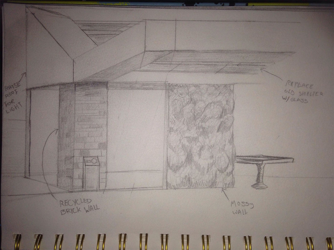
It was at this point that I started to look at similar projects to get inspiration for creating a visualisation of the space. I found that incorporating greenery into the design was important due to relaxing effect that it can have on people. Additionally, I found that trying to be eco-friendly when creating and also trying to use parts of the existing space was important to help give each of these areas a uniqueness to make it less dull. I started to create sketches showcasing my idea using a station from near me as a base.
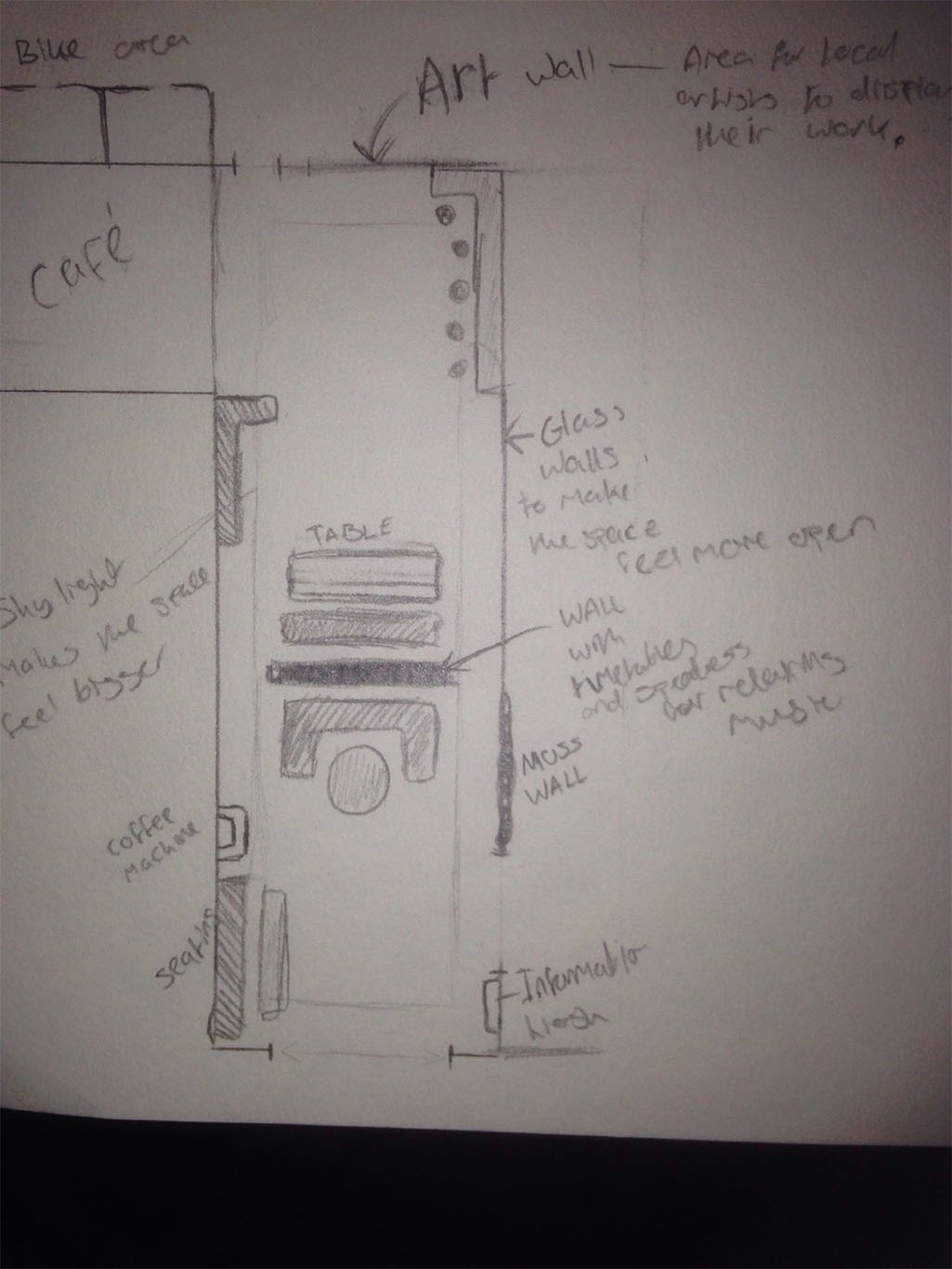
I also created Art boards that would help me support my idea.
- Date: September 2019-January 2020
- Year 2 Semester 1
Project Battleships
Year 2 semester 2 Transmedia 2020
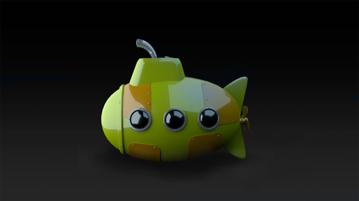
This project was created for the 2020 Transmedia fair that is held as an annual event for the University of Winchester's digital media students to show off their work to potential employers as well as friends and family. For this year's event, Myself and several other students of all disciplines decided to try and recreate the classic boardgame Battleships using AR (augmented reality). My role within this project was to create some of the ships featured in the game as well as creating a 3D model of an ocean which including animations and would serve as a base for scene in the Unity Engine.
For this project, I worked with a team of CAD technicians to help with designing the ships featured in the game, as well as a designer and developer who each created the concepts for our playable characters and worked on the code for the game in Unity respectively. We decided that each playable captain would have a different set of ships to fit their theme and divided the work between myself and the other members on my team doing work on the assets. I opted to work on the Dolphin character 'skippy' who's style consisted of 'Toy' themed ships which I could create in a more stylised manner.
As we were using a grid system for the placement of the ships we decided that it would be important to keep the ships to their original proportians and thus had to model them to specific measurements so as to fit inside their alotted 10mm x 10mm spaces. For example, The submarine is 30 mm long and 10 mm wide and would make it easier for our developer to position our assets within the game. For this submarine I started by researching designs for Toy Submarines and began work modelling.
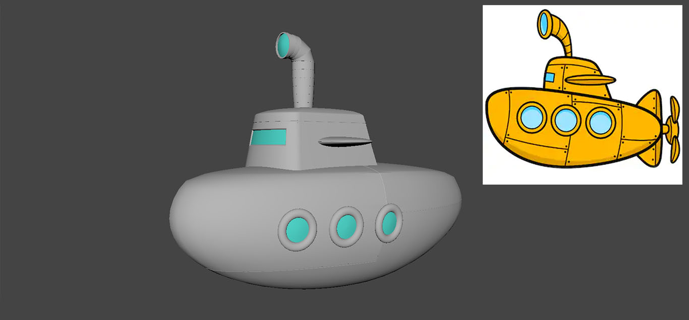
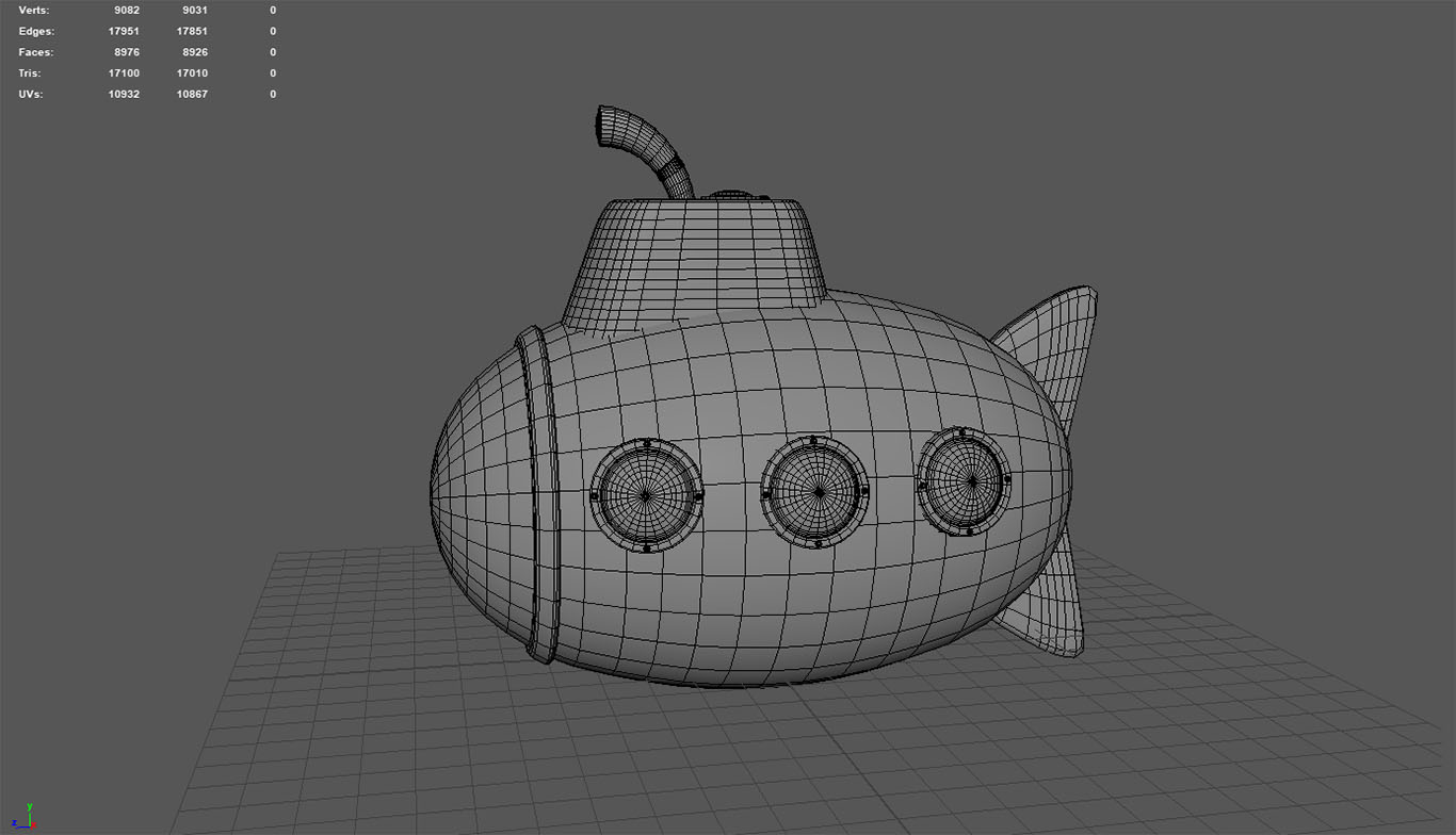
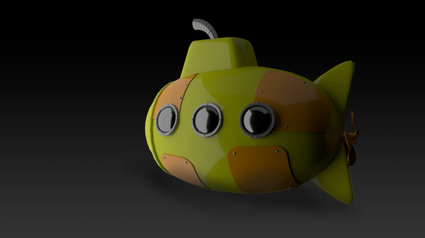
For organisation and to manage our time, we mainly used Slack and Google Drive so that we could keep track of what was going on and make transfer large files. Having this communication meant that the project was able to run with relative ease. This provided feedback for me to change the design of the submarine to something that would translate better into the game. With this new model I made sure that I had a clean mesh which would reduce any problems I might run into when exporting as FBX such as non-manifold geometry.

Additionally I created an ocean for the game in Houdini, a procedural modelling and animation software, for the map of the game. To do this I used the default small ocean preset as a base. For the wave effect I wanted, I decided to created it at 4k resolution at 256 pixels with an animation loop of 256 frames. In order to make this seamless I looped it by setting the loop period at 256 (number of frames) by 24 (the framerate) so I had a seamless loop that didn't jump. I then exported the displacement map which allowed me to use it later on.
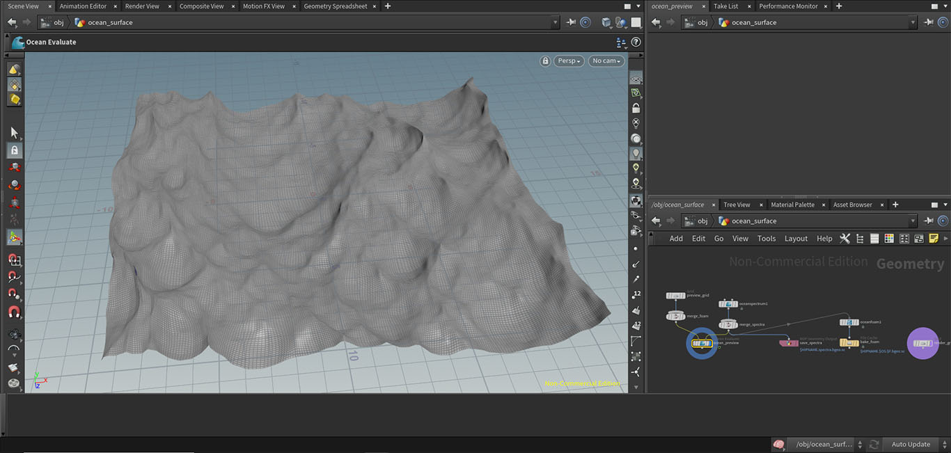
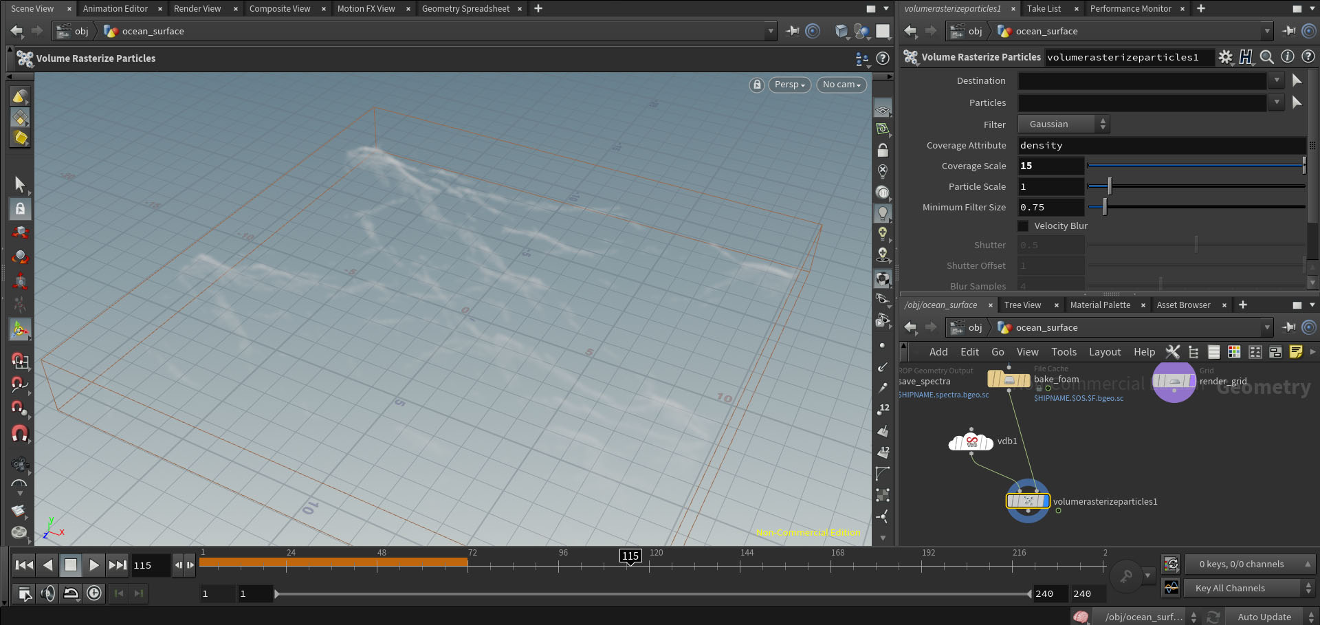
I next started working on adding foam to the waves to make the effect more realistic. To do this, I created a foam map using Houdini's node system that I could bake onto the mesh. (Below pictured the foam textures, placement of foam emitters and the baked map.)
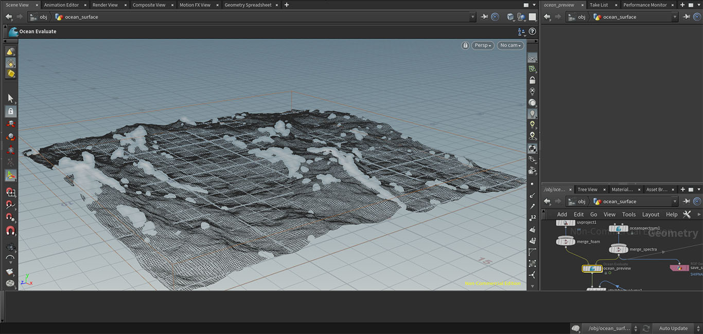
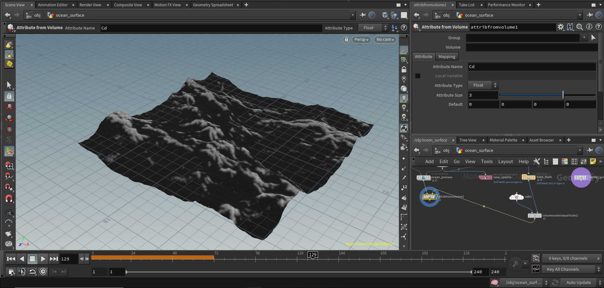
I then had to create UVs which are done through nodes and are simple as the mesh isn't very complex, and a normal map which I created by taking the displacement map and using the different colour channels to generate a normal map using a mosaic node to generate an atlas.
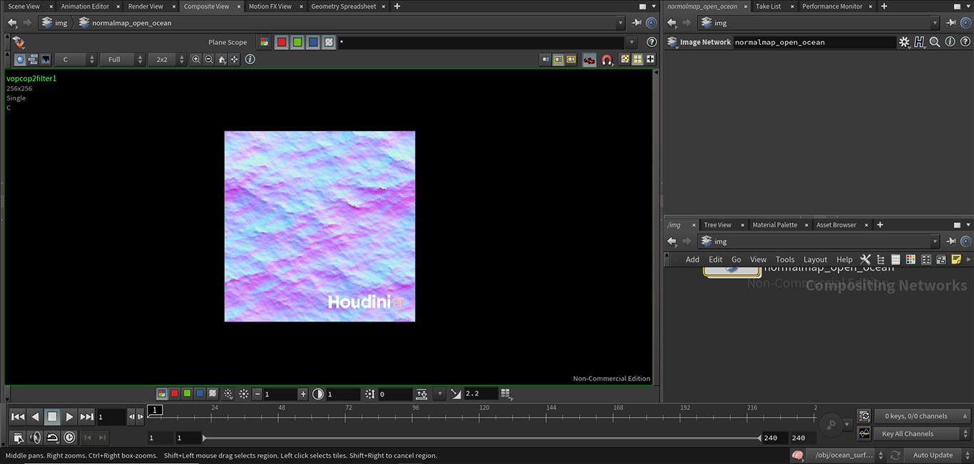
Now that the ocean has a normal, displacement and foam map it can be exported as an FBX into the game engine for use within the project.
- Date: January 2020-May 2020
- Year 2 Semester 2
Client Project Semester 2
Year 2 semester 2 group project
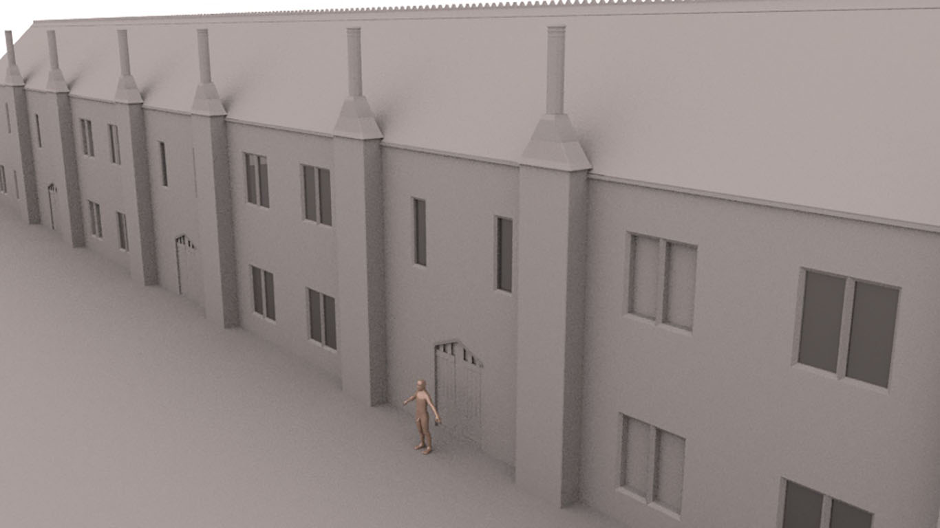
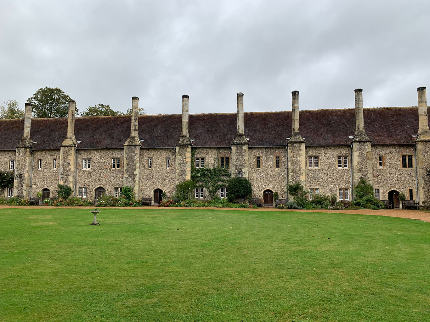
The goal of this project was continuing to create the environment for a correctly referenced, realistic model of the site of St Cross Hospital in Winchester that could possibly be used for AR/VR in the future. For this project I was in charge of creating textures for the different buildings within Quixel Mixer and modelling the Almshouses along the side of the main courtyard.
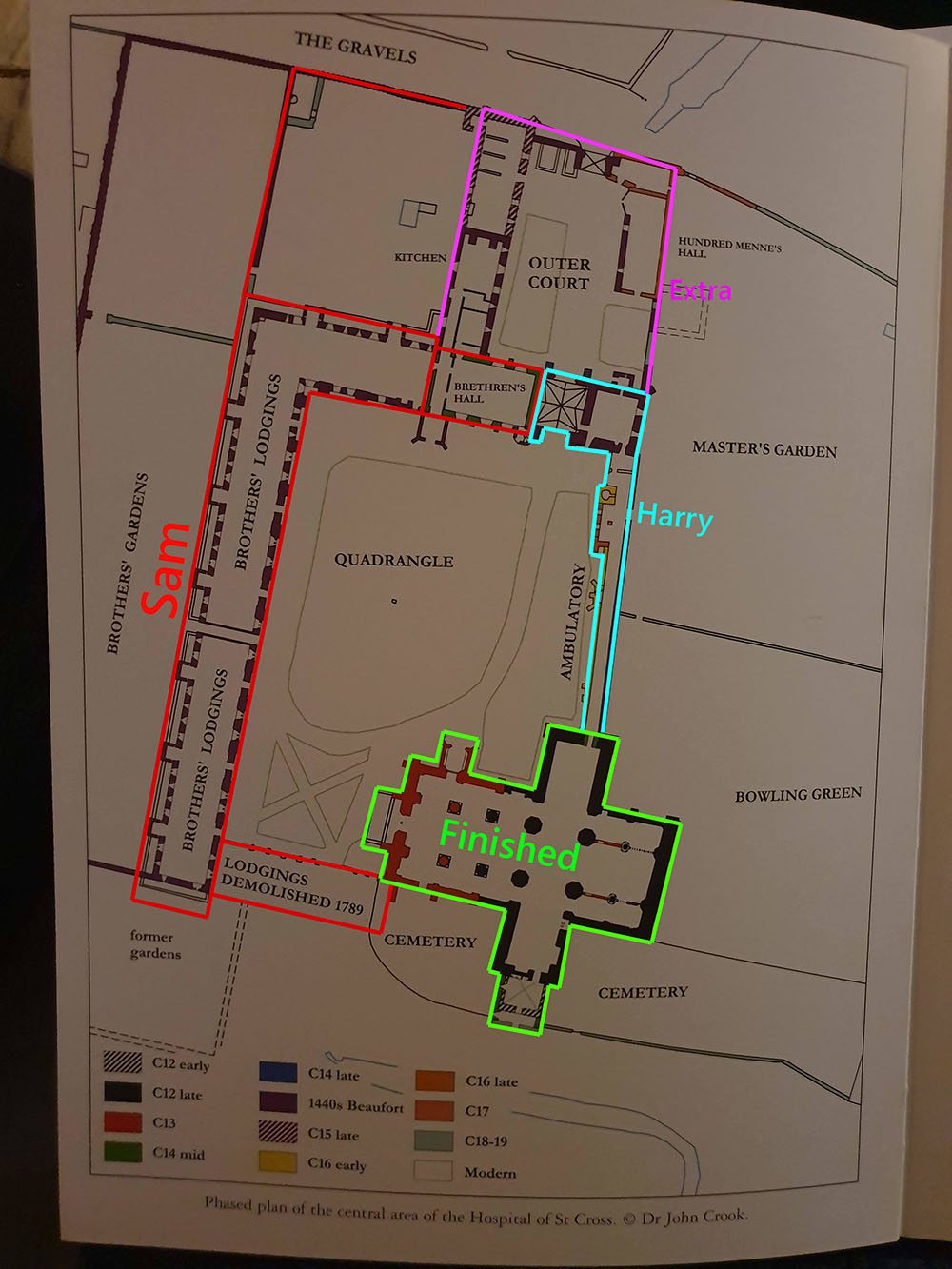
We started by gathering the references we would need of the site and deciding who would focus on creating which sections. I put together a slack so me and my partner could communicate and send files quickly and effectively and begun sending reference images for his sections of the site as well as my own. It was my task to model and create textures for the Almshouses along the right side of the site.
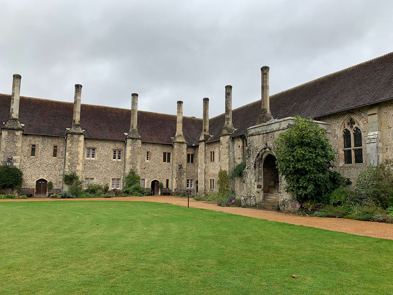
I started by modelling the buildings in a modular way which was efficient as it meant I did not have to model similar sections of the building multiple times. This also meant that I could create and unwrap UVs only two of the sections and duplicate them along the X axis in order to form the row of buildings seen in the picture. Once I finished work on the modelling for this section I began to work on the textures I would be using across the project.
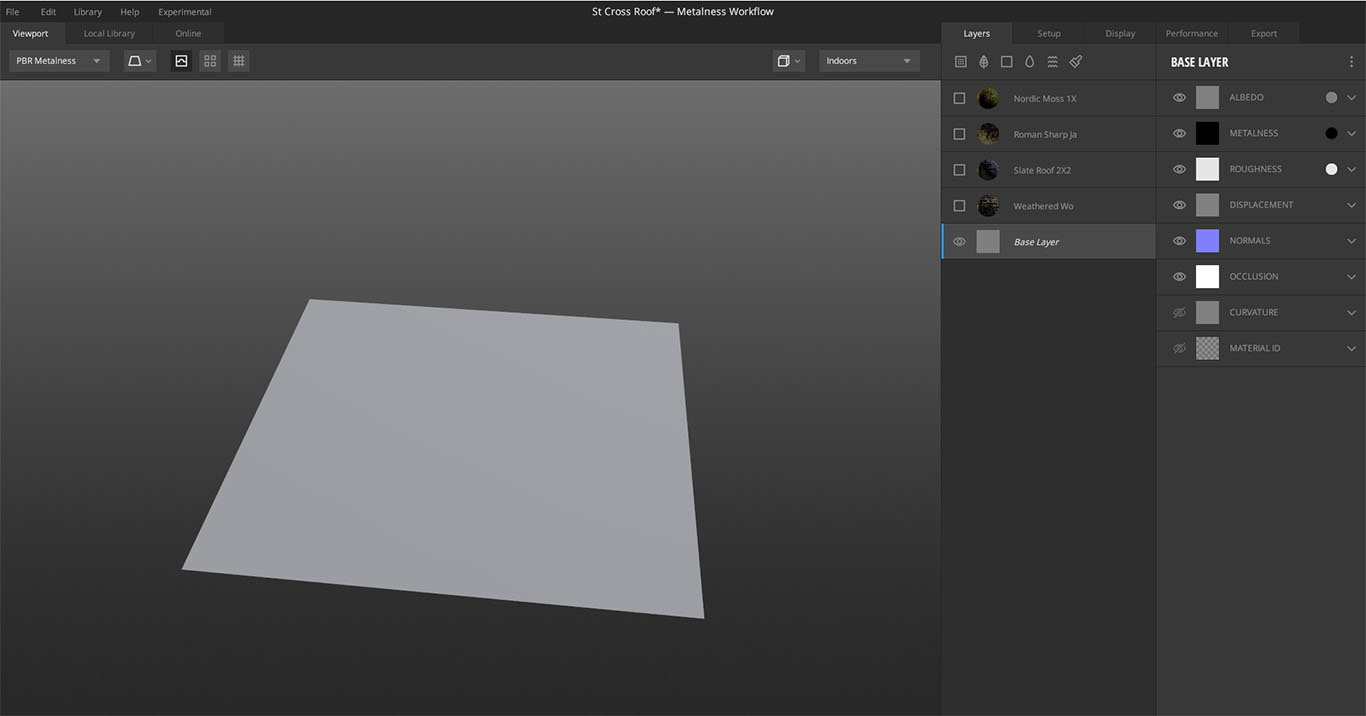
I created the textures for the project in Quixel Mixer, and I started with the roof tiles that are present on almost every building on the site. I first started with a regular plane as a base layer for my texture.
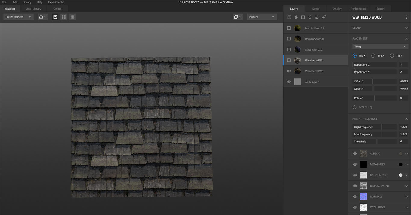
I then used the 'weathered wood slate roof' texture from the asset library as a starting point and tweaked the repeating of the texture on the X and Y axis to achieve the size I wanted for the tiles as well as the height frequency which causes the displacement of the tiles. On top of this I also slightly altered the Albedo colour to something closer to the mossy brown/grey on the old roof tiles in some of the reference images.
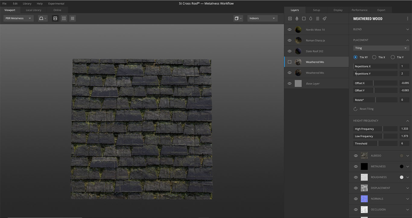
I then added a layer of slate which I wrapped to the underlying layer so that it was flush with tile displacement and again changed the colour of the albedo map to a darker blue colour for variety. To finish the roof tiles, I added moss and used the 'blend from below' setting which allowed for me to add moss inbetween the cracks in the tiles. Additionally I used 'Roman sharp jagged rock' texture on a low intensity on a mask layer to paint in weathering on the face of some of the tiles and along the edges.
Once I had recieved the first draft of my partner's model I was able to import all of the main sections, including the chapel I had created last semester, into a maya scene to tweak measurments and add materials before exporting into Unreal.
- Date: January 2020-May 2020
- Year 2 Semester 2
Social Media Campaign
Year 2 semester 2 social media
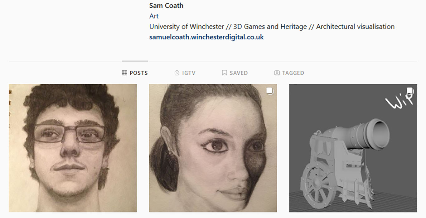
A social media campaign to gain experience promoting a business through social media, I decided to create a campaign about my brand. My platforms of choice were instagram and Artstation however I was unable to complete continue the entirety of the Artstation campaign.
Before I started my campaign I did research into where my audience, primarily artists and people interested in illustration and 3D, were located. From looking into a number of platforms I found that Instagram and Art station were likely to be my best options to gain traction for my campaign. This is because I already had an account set up on instagram that had a good amount of followers already. I also chose instagram as it is particularly visual oriented compared to other social media and would allow me to grab people's attention easier. My secondary platform of choice was Artstation due to it being a professional platform for artists and having good resources and connections to potential employers.
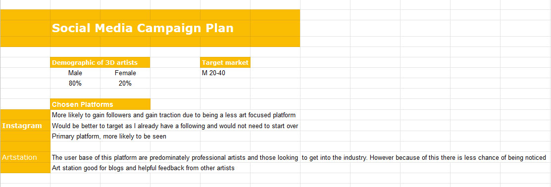
I decided to post content on Instagram on Mondays, Wednesdays and Fridays at 12:00pm. These posts would be more general and include traditional sketches and digital art as well as 3D work. For Artstation I would be posting weekly blog posts on Saturdays on what i'm working on for my current projects. These would go indepth about the workflow I used to achieve the task which would help me attract a more knowledgable audience on that platform and could help grow my own understanding on how I can improve.
My results: Followers increased 96 to 107 and my average number of likes were between 30-40 for each post.
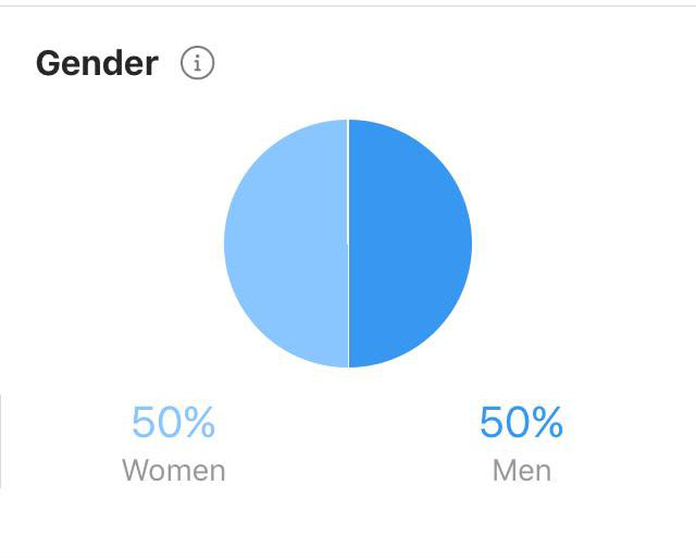
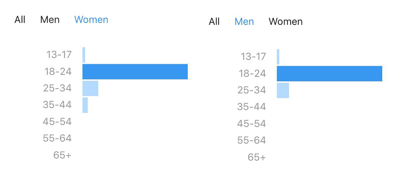
I learned from my Insights that my audience was a 50:50 split between males and females and that between 84 to 87% of them were between the ages of 18-24. There were no males over 34 that interacted with my posts however there were females that had. My statistics revealed that the best times to post were between 3pm and 9pm on weekdays and 6pm to 9pm on weekends. I found that the content of my sketches gained the most attention and that the majority of my audience were from London and Winchester.
- Date: January 2020-May 2020
- Year 2 Semester 2
